The Importance of Value
- Published:
- Length: 1641 words
- Reading Time: 9 minutes
On February 17, 2018, I gave a presentation to my local Studio Art Quilter Association (SAQA) pod about value and its importance in quilting. Below is the information I presented. Although I used photos of quilts that had hung at the 2017 International Quilt Festival as examples in my talk, I do not have permission to use those works publicly, so I have instead substituted examples from my own portfolio. Although they aren’t traditional quilts, all the pictures I’ve included below were made entirely out of fabric.
What Is Value?
By definition, value is the lightness or darkness of a color. It can be seen on a value scale:
The lightest value is white, while the darkest value is black. In the center is middle grey, or pure color. If you take the pure color or middle grey and add white, that’s called a tint. Conversely, middle grey or color plus black is a shade.
What About Color?
Below are value scales shown with the three primary colors: red, blue, yellow. (I’ve used Magenta and Cyan below because I come from a graphic design background, and those two colors are the primaries used in printing.)
The value scales in color are shown on the left. I’ve converted those same scales to grayscale to more easily determine the value of each individual block, and those converted scales are shown on the right.
Why Does Value Matter?
To show how value is important when designing a picture, I’ve prepared a very simplified example below:
It’s obviously a landscape with a sky, mountains, and lake. Yet it looks flat. That’s because every color in the picture is almost the exact same value. Look at the image below as it changes to grayscale. Once the color is removed, it’s impossible to tell where each element of the picture begins and ends.
To fix the problem, I’ve gone back and added some white or black to each color. Now it’s much easier to see what’s what when the color is removed. In addition, the color version of the image also has a lot more depth to it.
Pelican in Paradise
My first fabric example is Pelican in Paradise, a picture I made in 2004 when I was still in high school. I fell into the trap of getting so enamored with colorful fabrics that I completely lost track of my values. (The value problems weren’t pointed out to me until I showed my portfolio to my professor in college. I was rather affronted at the time that he dared offer a negative comment about my beautiful picture, but he was right!)
Below on the left is my original Pelican in Paradise. In the middle, I’ve used red to highlight the specific areas that have value problems. On the right is the original picture shown in grayscale.
(“Value problems” means that two areas of the picture, such as something in the foreground against something in the background, have the same value. As a result, one or the other area, or both, will be difficult to discern because they don’t “pop”.)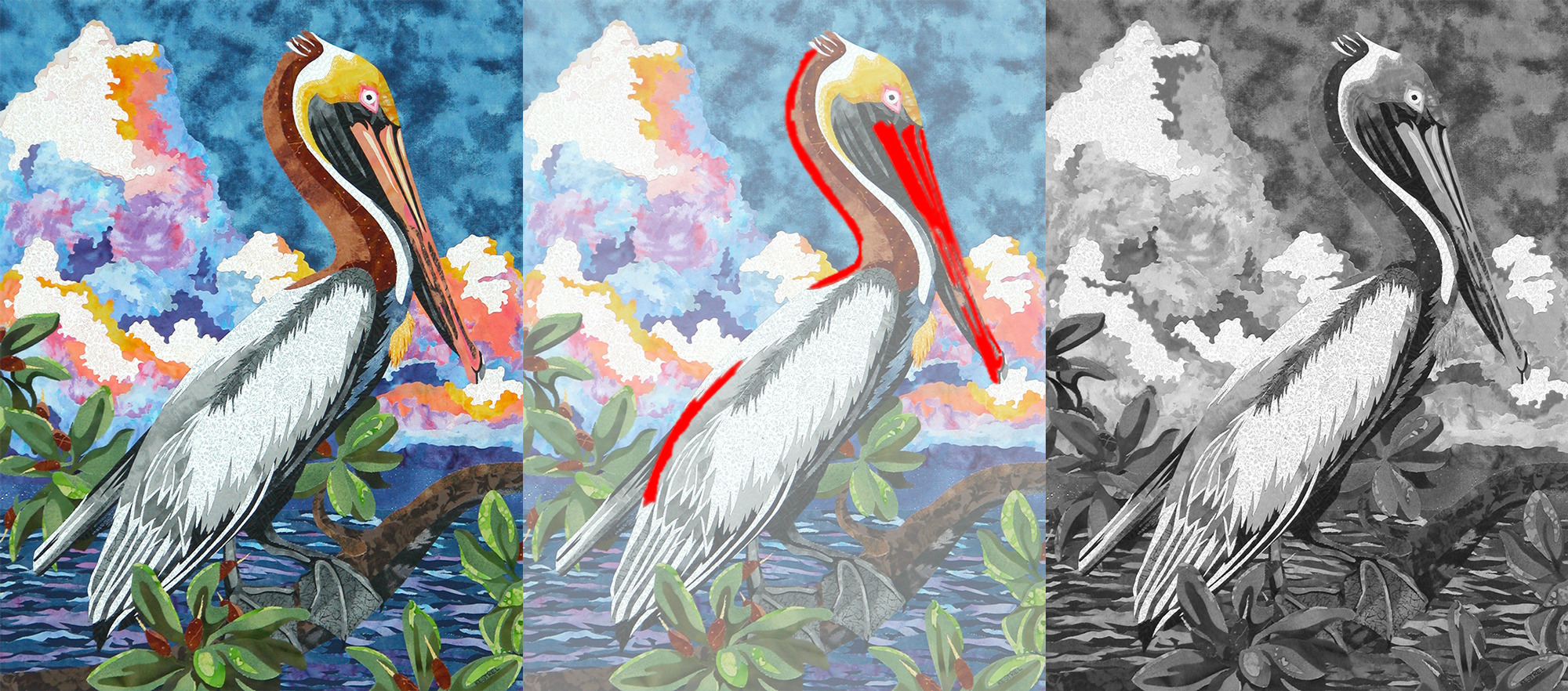
If I were doing this picture over again, I would make a few changes. I’ve made some corrections in Photoshop to show you how those red problem areas could be fixed.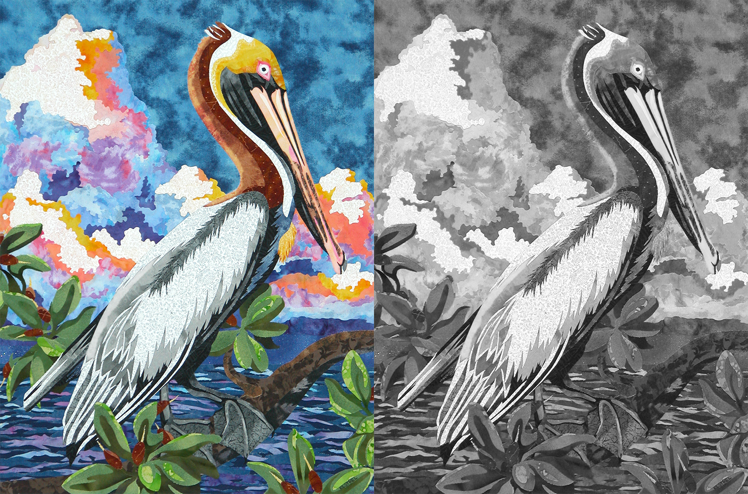
Notice how much better the pelican’s neck, back, and beak show up against the background. He is much easier to distinguish from the clouds and sky with just a subtle change to the value of the fabrics.
Bald Eagles
This picture was part of my college thesis. It’s one of my personal favorites, even though it did end up with a few value problems.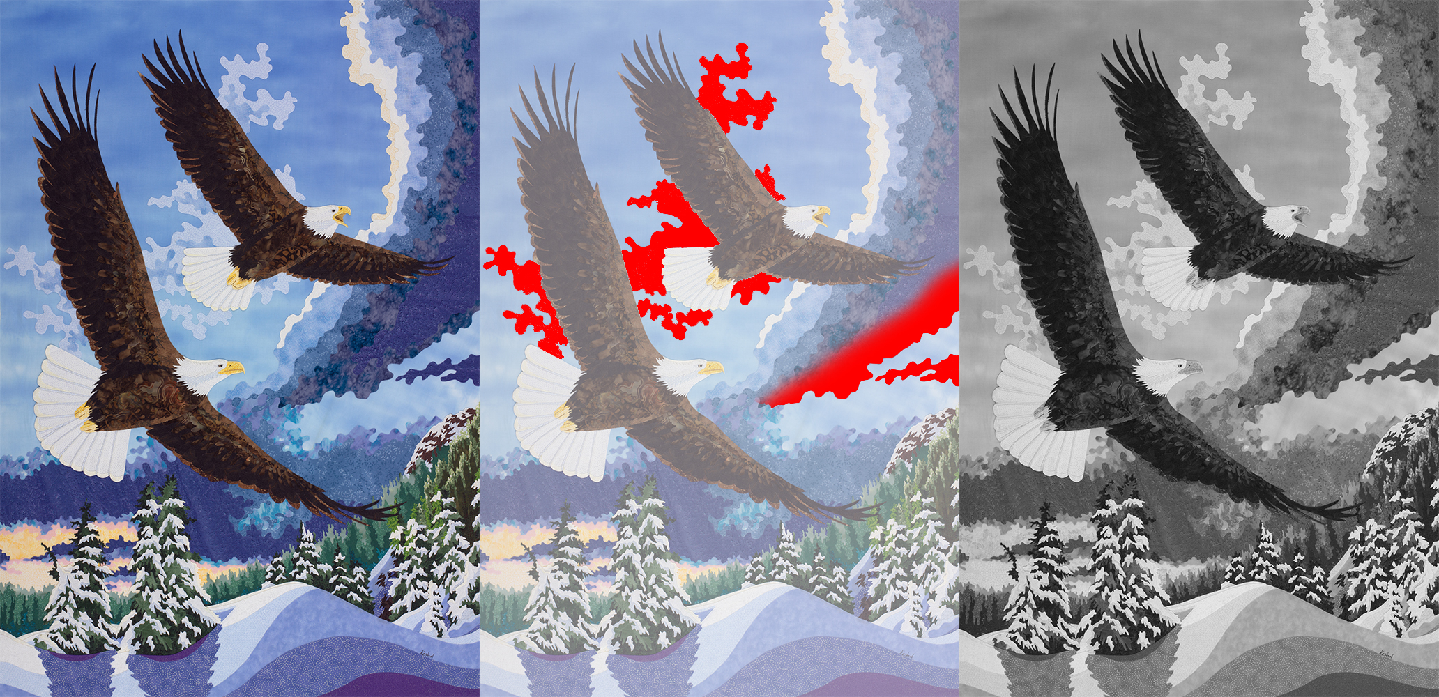
- The whispy clouds behind the eagles are distracting and blend in with the eagles’ heads and tails.
- The dark blue in the sweep of cloud is too dark and is drawing attention away from the eagles. The contrast between dark blue clouds on the right and the light sky behind them is greater than the contrast between the brown eagles’ feathers and the sky behind the birds. As a result, the cloud draws viewers’ eyes when it’s really not the subject or focal point of the composition.
I actually did end up fixing this picture in 2015 because the blue sky faded away to nothing. I had apparently not properly fixed the dyes I had used when I originally painted it. The new version of this picture has the whispy clouds removed and a much darker blue sky.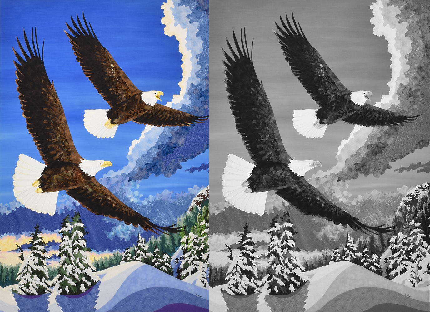
Now the eagles really pop against the blue sky, and the dark clouds on the right aren’t as dramatic.
Embrace Change
Embrace Change is a recent creation from early 2018. I ran into a different sort of value problem with this picture. See below: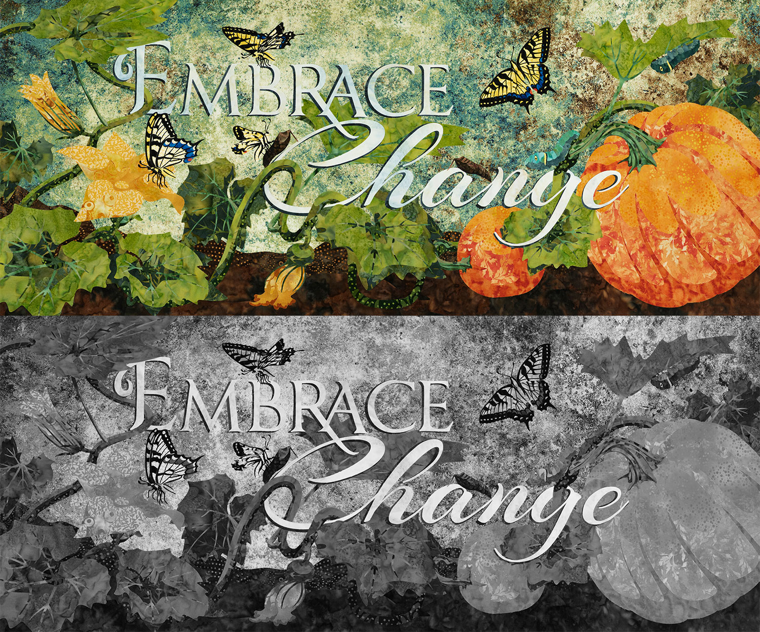
My subject matter (flowers, butterflies, vines, pumpkins, and text) span too much of the value scale. I had a very hard time picking the background because every fabric I considered caused at least one piece of the foreground to disappear. Ultimately, I decided I would rather have the butterflies and text stand out. That meant choosing a background with a lot of middle values, causing everything else to disappear.
If I were to ever make this picture again, I would probably have to dye my own background. That would enable me to make it dark behind the butterflies and flowers, but light behind the leaves, vines, and pumpkins.
This is my digital template with a few different backgrounds that are much less complex than the one I ultimately chose: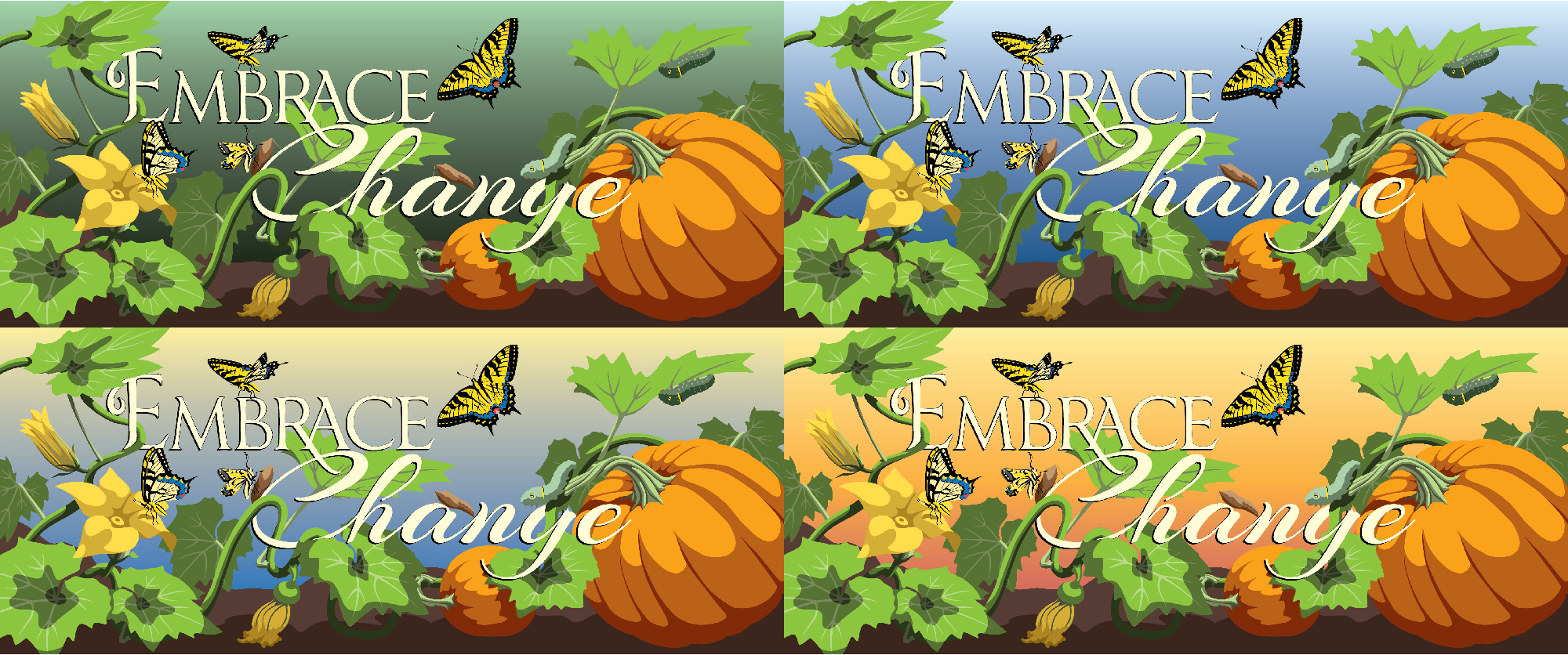
Misty Moose
Another example from my college thesis, Misty Moose is a very good example of value “done right”. Take a look: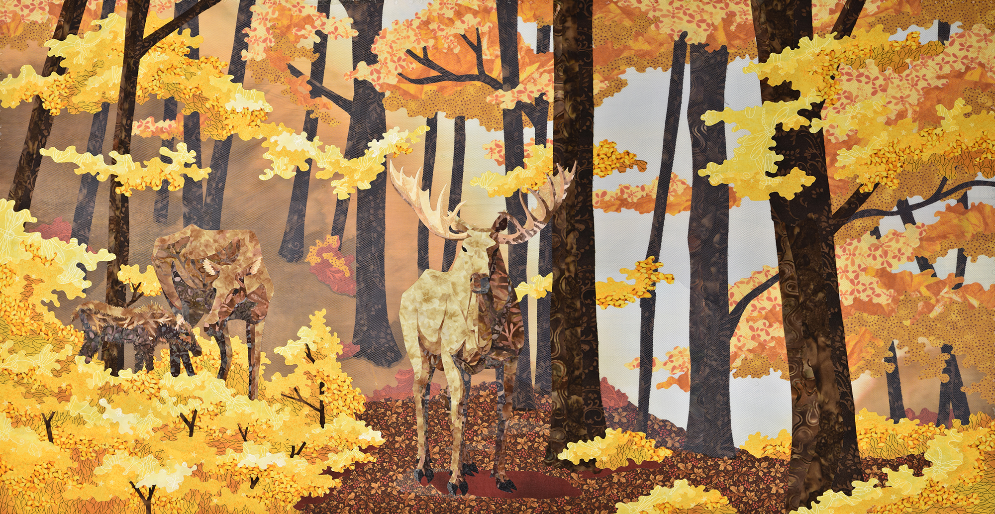
The first place the eye travels is to the almost-black trees against the bright foggy white on the right side of the picture. That’s because that area has the most contrast in the entire image.
Second, we look to the left at the male moose standing dead center. He’s lit up by the sun and obviously drawing attention to himself as he stands against the dark trees.
Third, we glance around the picture looking at the intense yellow leaves until we come across mom and baby moose tucked into the foliage on the far left. I deliberately chose brown fabric for the mom and baby that were extremely close in value to the trees and background so that they would blend in. I did not want them to stand out.
Take a look again as Misty Moose transitions to grayscale. Notice how the mom and baby blend right into the background.
I used one last trick to help give this picture more depth. I added two layers of thin, light blue tulle in between the background and foreground. This helped visually push some of the trees and hillside further from the viewer. The extra dark, rich trees are in front of the tulle. The washed-out looking trees are under the tulle.
Practical Application
Now you’re an expert on value and understand intuitively how important it is to consider when designing a picture. How can you use that newfound knowledge?
Photoshop
Follow these steps to check the value of a photograph in Photoshop:
- Open image.
- Create new layer and fill with black.
- In the Layers panel, open the Blend Mode dropdown. Choose Color.
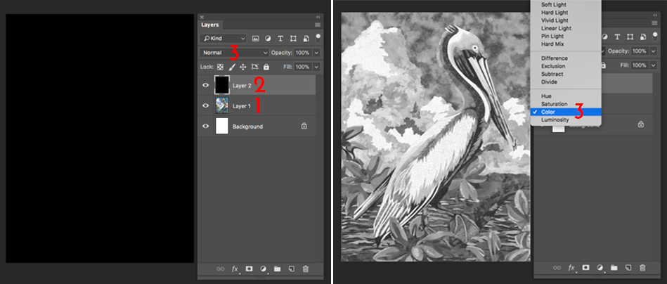
Note: You can also use Photoshop Elements, although the above instructions will not work. Google instructions for changing Blend Mode in Photoshop Elements.
Illustrator
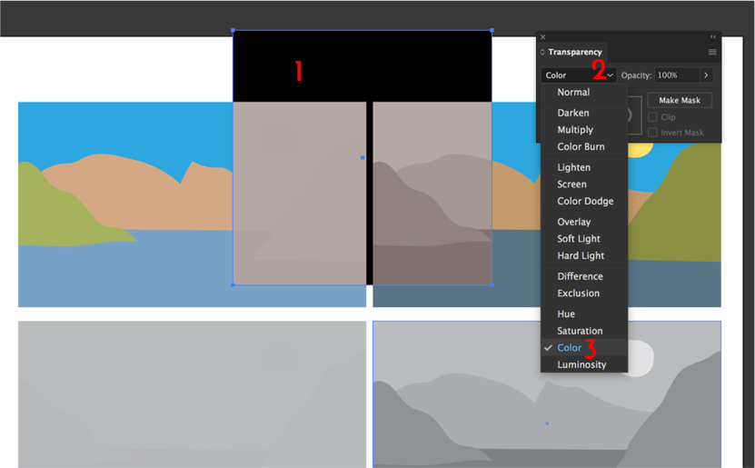
Follow these steps to check the value of a photo or drawing in Illustrator:
- Draw a rectangle & fill it with black.
- In the Transparency panel, open the Blend Mode dropdown.
- Select Color.
- Any picture or object placed under the rectangle will show up in grayscale through the rectangle.
Cellphone Camera
Follow these steps to check value in real-time using your phone's camera:
- Open your camera app.
- Select filter circles at top right of screen.
- Slide options over to "Mono".

Note: You can also use your Android phone’s camera, but as I only own an iPhone, I don’t have instructions for Android.
