A Happy Little Accident
- Published:
- Length: 775 words
- Reading Time: 4 minutes
I was around three-quarters of the way through making my newest quilt, Morning Commute, when I made a mistake. In the words of Bob Ross, "there are no mistakes, only happy, little accidents," and it's true that this accident ended up making a stronger image. But at the time, I was demoralized because keeping the accident, which I liked, had certain ramifications for the design of the rest of the quilt.
What happened?
I designed Morning Commute to have the light at the top of the quilt. There was an undisclosed light source, like a cloud-covered sun, that was lighting the fog in the top right corner of the picture. This was my template and original design for the quilt:
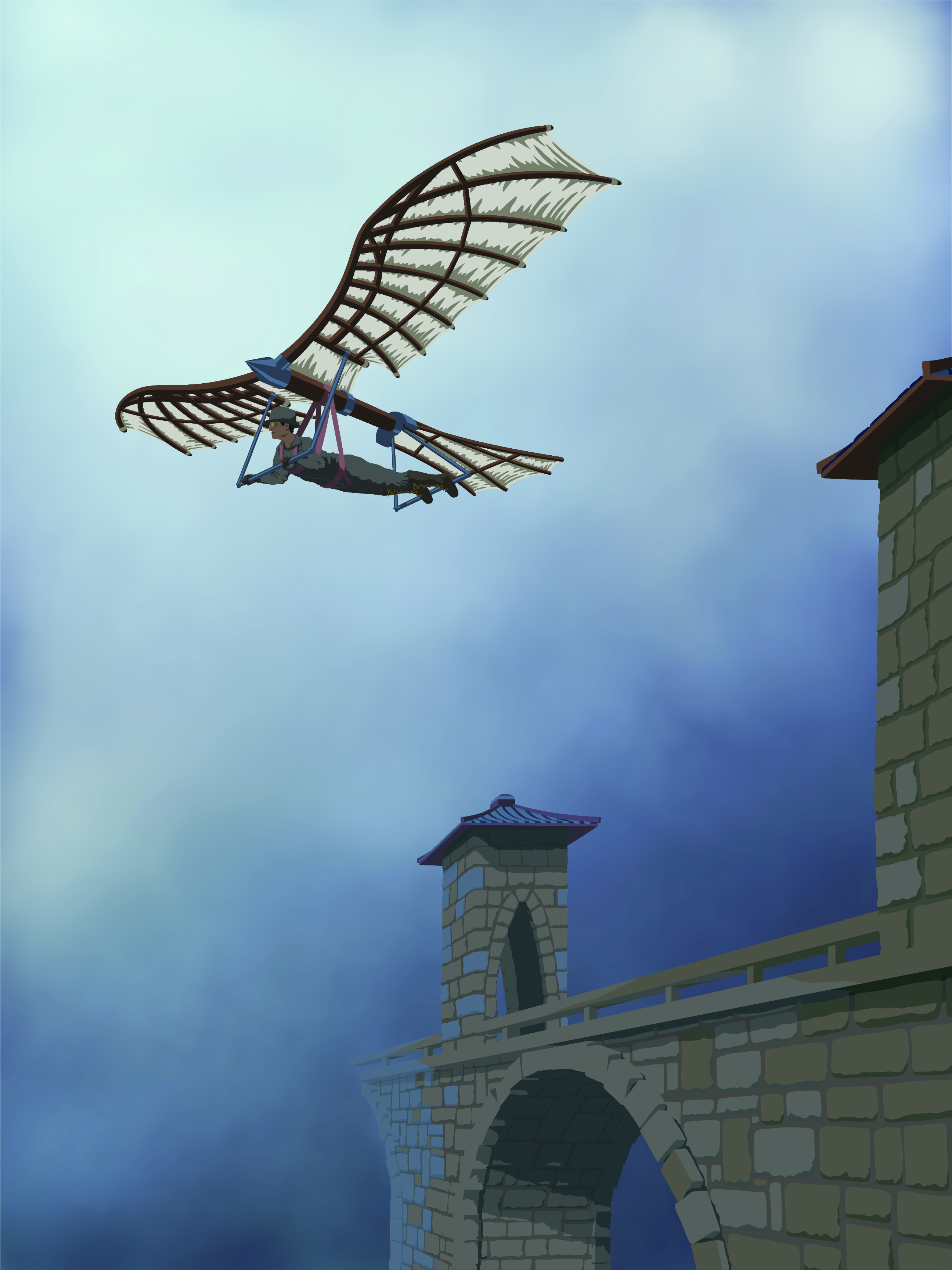
When I finished assembling all the appliqué pieces, I laid the bridge, man, and flying machine on the background to see how they'd look against the sky for the first time. The problem was, I laid them on an upside down sky.
The picture on the left has the sky upside down, so the light is at the bottom. To the right is a pic with the sky the "correct" way, or at least how I'd designed the quilt.
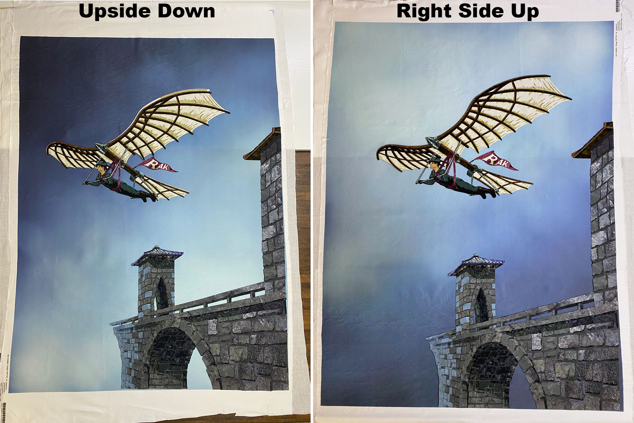
This shouldn't have been a problem. I could have easily turned the sky the correct way up and continued on, since nothing was attached to the background, yet. Except...I LOVED the sky being upside down!
Morning Commute was intended to be a slice-of-life kind of picture. It shows a man going to work. There's nothing dramatic or exciting about that, and having overhead lighting fed into the banality of the scene. That's how the world works: Light comes from above. The simple act of turning the sky 180° added an element of intrigue that simply wasn't present in the original design, entirely because the light source shifted. Light from below is unusual, unnatural, and therefore, eye-catching. All of a sudden, my unassuming design had this draw I couldn't ignore. The upside-down sky had to stay.
What's the problem?
Changing the light source in my scene by 180° caused a very big problem for the rest of the design: None of the shadows made sense any more. Remember, I'd designed this quilt to have overhead lighting from the front, so that's the direction all the shadows come from. But now, by changing the sky, the light source was from down low and behind the bridge.
In addition, the bridge no longer had the appearance of disappearing into the mist. The fabrics I'd chosen were intended to blend with what was now the sky.
I've detailed the new problems with the design on this photo:
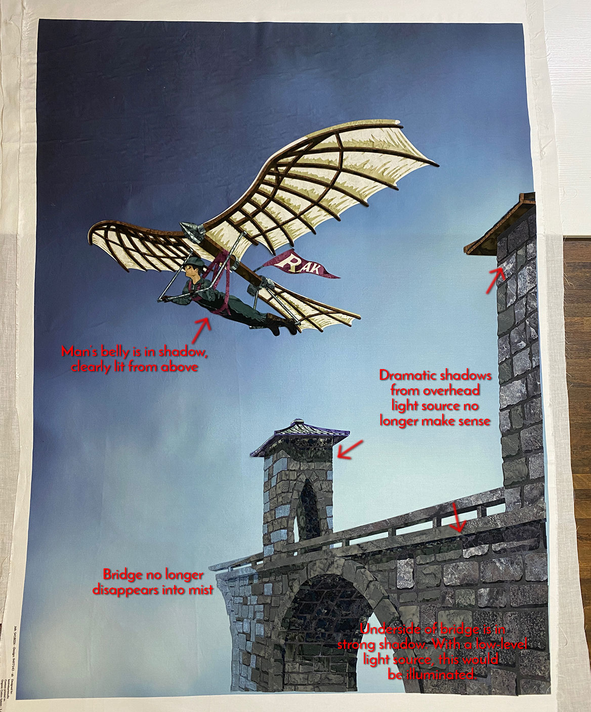
All of this made for a very big problem because it's not like I could mix up a new batch of acrylic and paint over the picture. I was afraid the change in sky meant I was back to the drawing board design-wise, and would probably need to spend another 30-40 hours redoing the shadows, preparing and cutting new fabric, and assembling a new bridge and man.
Figure out what needs to change
I had started this quilt by making a FlowScape scene to get the perspective of the bridge correct. This turned into a great boon now, because I had a ready-made way to test how a new light source would affect my objects.
I went back into FlowScape, added a light behind the bridge, and was very surprised at the result.
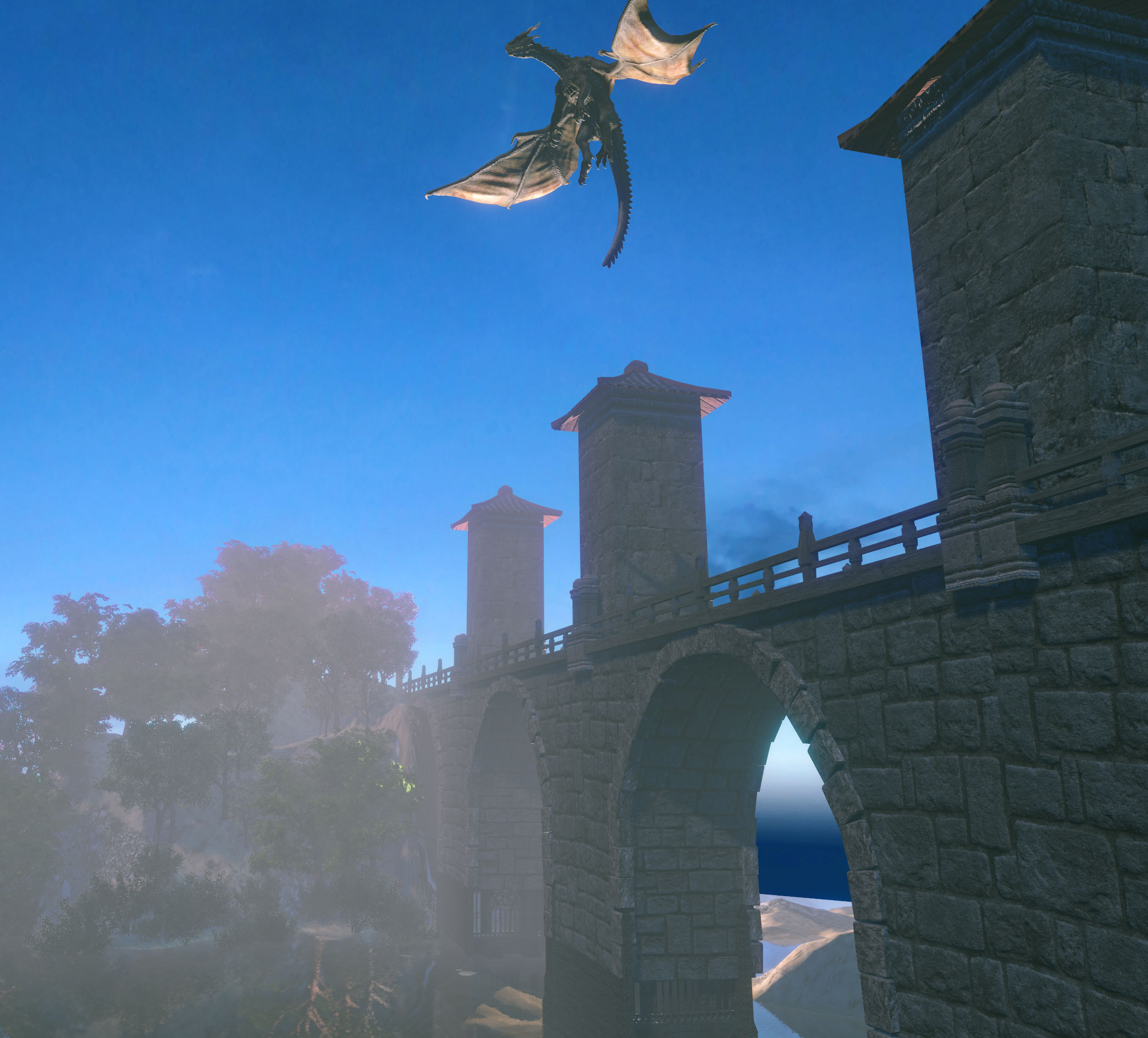
It's clear there's a light on the far side of the bridge because the dirt, seen through the archway, is brightly lit. However, the archway itself did not change at all. This was really good news, albeit entirely unexpected.
In fact, the only change the new light source caused on the bridge was to illuminate the underside of the tower roofs, another unexpected result. The dragon's wings are also brightly lit, but that I had anticipated.
The proof was in the pudding, as Grandma used to say. Thanks to FlowScape, I now knew the changes required to match my appliqué man, machine, and bridge to the new light source were entirely manageable and not the catastrophic disaster I'd feared.
Fix it
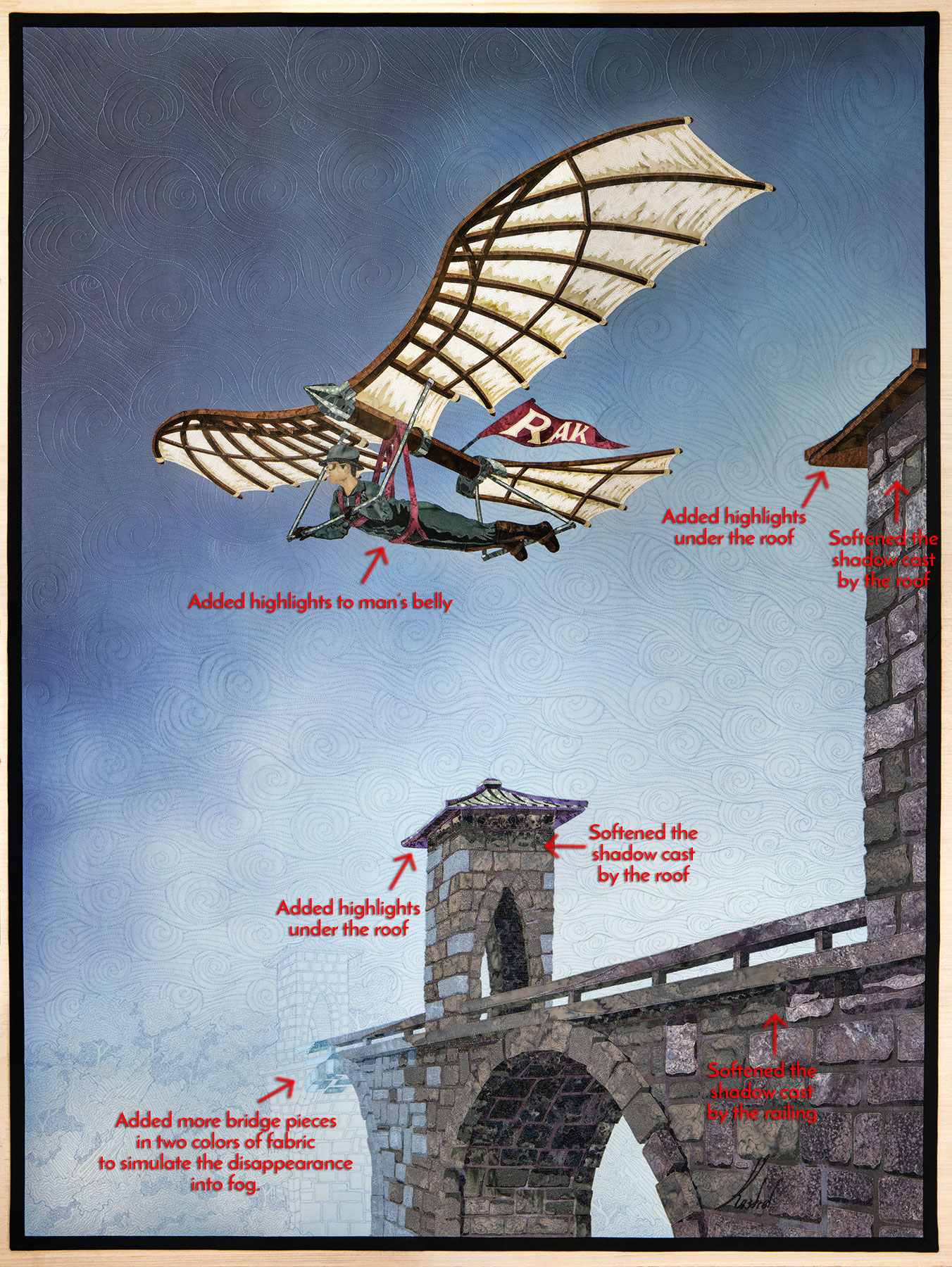
Here is the finished quilt, with callouts to the changes I made to account for the new light source.
