Ship Design is Critical
- Published:
- Length: 904 words
- Reading Time: 5 minutes
To make the best composition, all elements of that composition must work together. Makes sense, right? Not so fast. This simple concept can be pretty tricky to execute successfully, especially when creating things that don't exist.
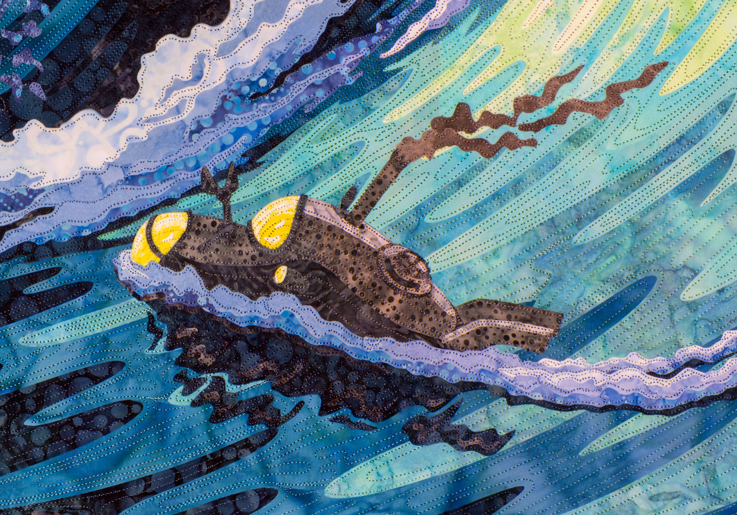
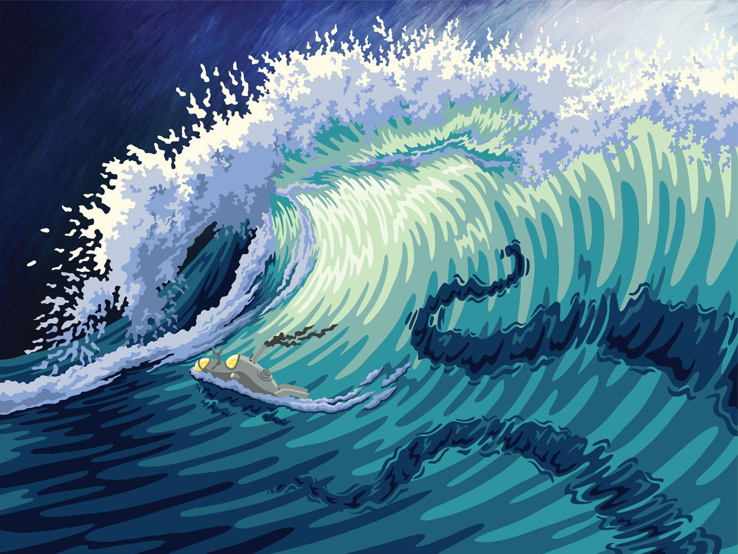
Today, we're going to take a look at There's Something in the Water. Here is the finished quilt:
More specifically, we are going to focus on the submersible.
This little vessel did not start out looking this way. It went through six completely different design revisions before I settled on the look you see above.
Why, do you ask? Why was it worth putting in so much effort to such a small component of the overall design? For me, the answer is simple: The first five version just weren't right.
Version 1
This first design was my initial idea for a steampunk ship. It looks very different from modern, real-life vessels. The glowing orb on the front was an observation platform, an idea inspired by the dome on the submarine in Jules Verne's 20,000 Leagues Under the Sea.
Although this ship was definitely "out there", it looked too different from recognizable ocean-going vessels, which had the effect of making it look like a toy instead of a "real" steampunk ship. Back to the drawing board.
Version 2
For the second design, I re-drew the ship with a single, central mast and sail, inspired by viking ship designs. I also added a smoke stack at the stern to indicate the presence of a steam-powered propulsion system.
This was better, but still not great. This ship still looked toy-like, and the sail wasn't billowing correctly. Time to try again.
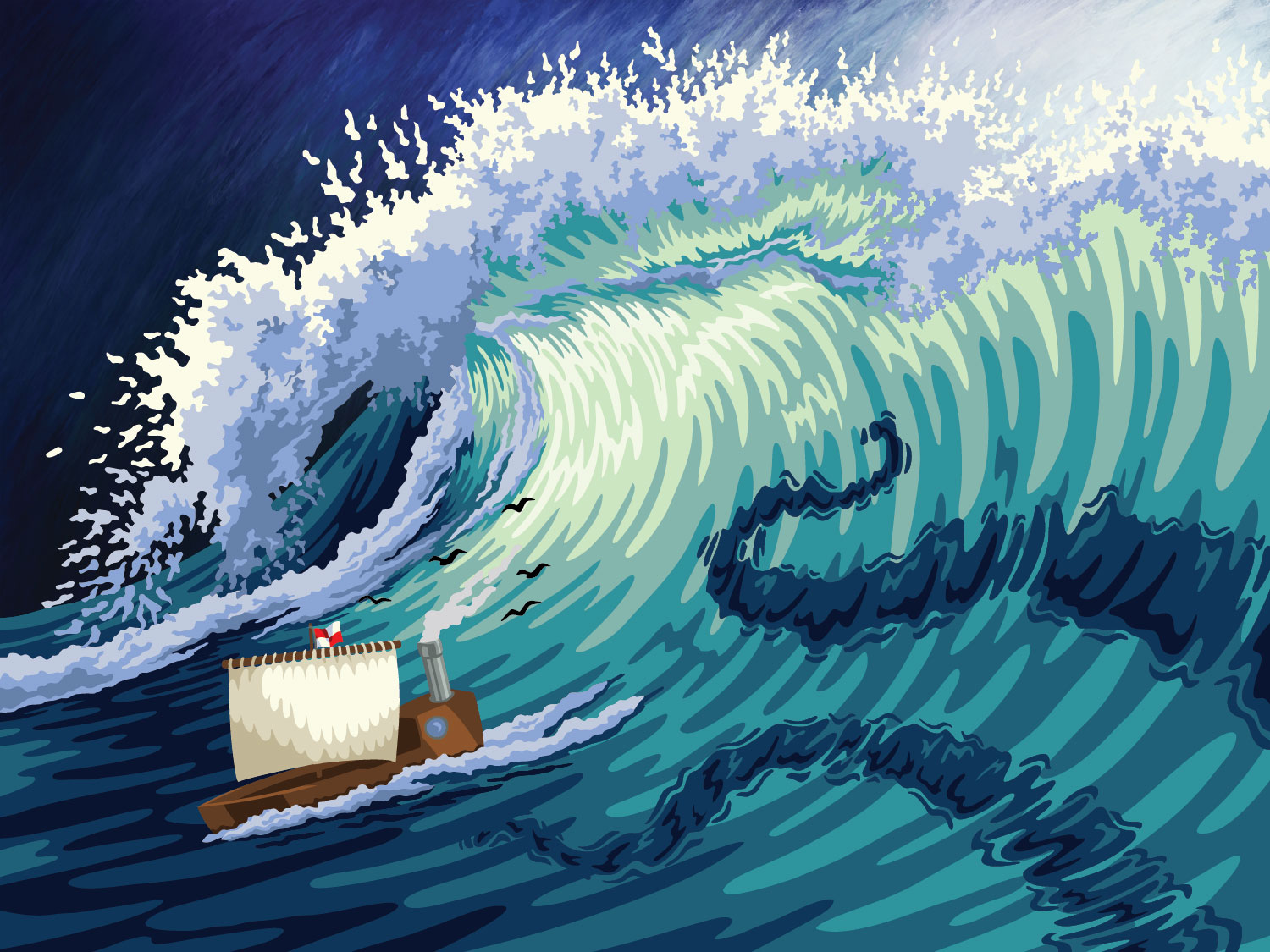
Version 3
The ship in version 3 really started to look like a steampunk ship, with two smoke stacks, and boiler on the deck, and stern-mounted propulsion system. I also added a gear figurehead on the bow.
My parents and husband had been giving me feedback all along, and this ship was their favorite so far. However, they pointed out that a boat being propelled through the water would not also have a sail open. And Dad — who has sailed boats in the past — said the mast and sails in my drawing were far too small. More changes were need.
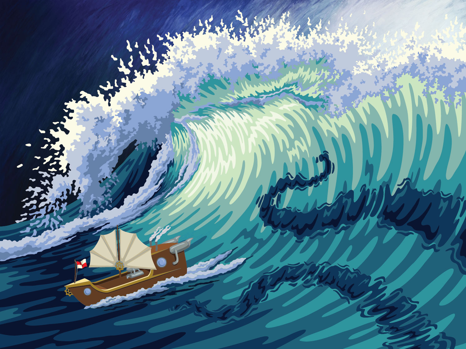
Version 4
I re-drew the mast with its sails folded up. I also added visible jets to the propulsion system at the stern of the ship. However, I never ended up completely drawing the part of the ship that had been covered by open sail in Version 3, so this ship is missing part of the deck and cabin.

Even though this was the best ship I'd come up with so far, it still wasn't working for me, and it was only after having drawn this fourth version that I finally realized why: The ship was drawing too much attention away from the wave.
If I removed the ship from the design, the wave was clearly the focal point. The illuminated part of the wave was close to the center of the entire composition, and all other lines in the design were drawn so that they swept a viewer's eye right into the middle. Adding the ship ruined that effect because it stood out so much. The ship was made from colors and fabrics that don't appear anywhere else in the design, making it compete for attention with the illuminated center of the wave.
I still wanted to have some sort of manmade vessel clearly sailing away from the tentacles, so I needed to design a ship that blended in.
Version 5
I had the idea to try a submarine instead of a ship. Most of the design would be under water, but the part sticking out of the water would be a gunmetal grey. That would keep it from competing for attention with the rest of the composition.
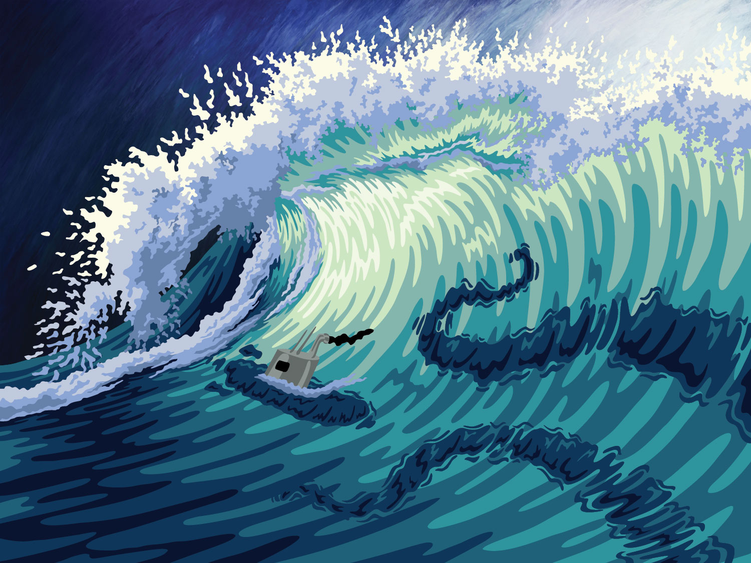
My critique group unanimously agreed this idea was the best yet, although it still needed some work. This ship was too close to a real submarine; in other words, it wasn't steampunk enough. In addition, Dad pointed out that a submarine travels faster if it's fully surfaced, and since I wanted this ship to look like it was moving as fast as it could go, I needed to draw more of it above water.
Version 6
Here is the final, finished design: a steampunk submersible traveling a full speed along the water's surface (although some of the vessel is still clearly below the waterline.)
I hope you've enjoyed this peek into my brain and design process. This scenario — the back-and-forth, design-and-redesign process — is something I work through for each and every quilt.
