Visual Makeover
- Published:
- Length: 637 words
- Reading Time: 4 minutes
My website has a whole new look! In fact, my entire online presence has been upgraded to the new style. And it's about time!
This redesign has been a three year work-in-progress. Shortly after I made my first steampunk quilt, Rose, in 2018, I started thinking about a new look for myself that felt more...me. The dilemma was that I needed a visual identity that tied together three different audiences:
- Fine Art: My work is, first and foremost, fine art. Even though fabric isn't traditionally a fine art medium, I have been treating my work like fine art (using archival materials, proper care and handling, high-quality craftsmanship, etc.) my entire life. "Fine art" is synonymous with "valuable", so I treat my fine art quilts like they're precious.
- Fantasy: I have always adored fantasy worlds, but the specific genre that most appeals to me is Steampunk. I want my fellow nerds who understand science fiction and fantasy to appreciate my designs.
- Quilting: On a technical level, the artists to whom I most closely relate are other art quilters because we all create with fabric. The art quilting community has been such a positive support system for me as I took my first steps into the quilt world, I want to continue being a part of that network now that I'm established.
As a bonus, I was trying to work in elements of a kestrel — whether the whole bird or even just feathers — to represent me, specifically.
In two years I went through many, many different ideas of how to blend all these facets of my identity together into one unified design. The final result is what you're seeing now: My own unique twist on the Art Deco style.
Why Art Deco?
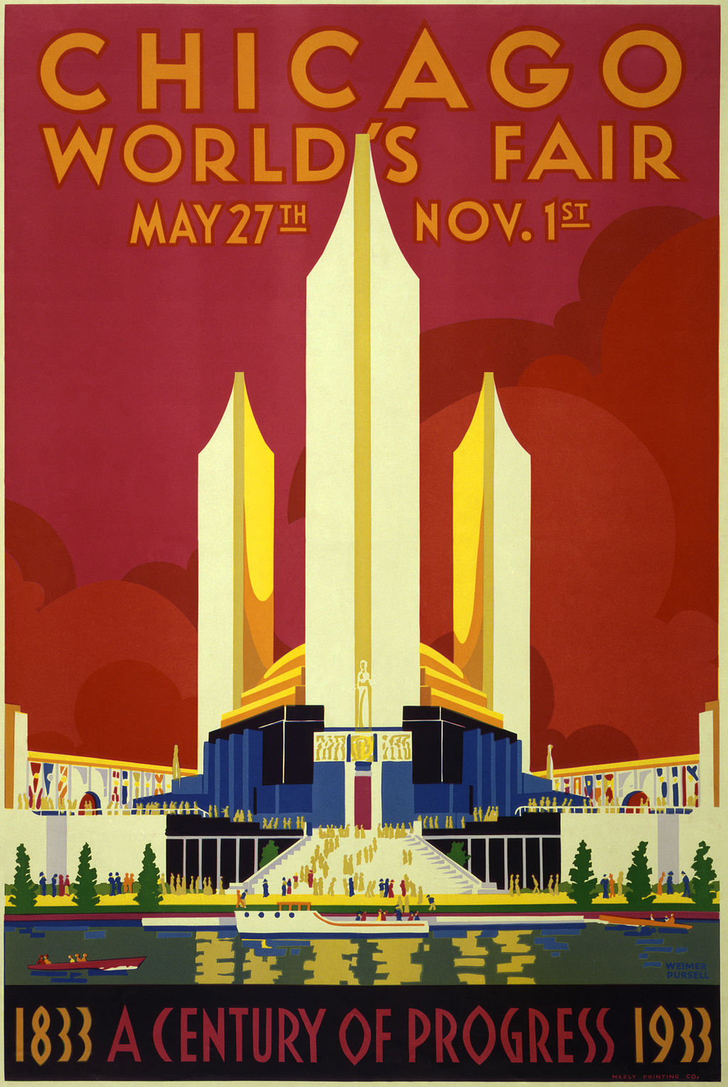
Art Deco is an art style that became popular during the Roaring 20s.
It combined modern styles with fine craftsmanship and rich materials. During its heyday, Art Deco represented luxury, glamour, exuberance, and faith in social and technological progress. - Wikipedia

The Art Deco designs of the 20s represent wealth, grandeur, and exquisite craftsmanship — exactly the association I want with my fine art.
Art Deco ties into my Steampunk quilts in two ways. First, Steampunk is Victorian science fiction. Even though Art Deco developed several decades after the Victorian era, it still has the "time gone by" or "long time past" vibe to its design.
Second, the Art Deco style rose in popularity when the pervading societal mentality was focused on mankind improving for the future. There was a belief that societal structure, scientific discoveries, and engineering inventions would lead to a better future for all. In other words, "progress." That parallels the Steampunk genre.
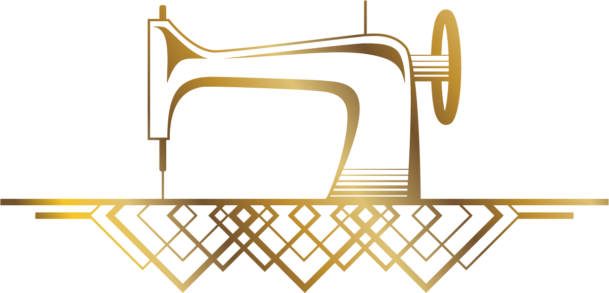
To tie in with quilting, I created some custom Art Deco icons to use on this website and anywhere else I show my visual identity. Take this sewing machine, which also appears in the sidebar:

I drew a 1920s Singer sewing machine in Art Deco style. The overlapping squares underneath loosely represent a traditional quilt.
Last but not least, I created a brand new Kestrel logo for myself that shows my namesake bird, also drawin in Art Deco style.
What about the colors?
Purple and yellow have always been my favorite complimentary color harmony. Purple just so happens to have an association with royalty, luxury, wealth, creativity, and grandeur...so it fits right in with the subliminal message I wanted to send with my Art Deco visual elements. I changed the yellow to gold for a much more literal visual association that still works in the purple/yellow color harmony.
