Impressions of Color
- Published:
- Length: 898 words
- Reading Time: 5 minutes
One of the great benefits to designing a quilt digitally is the ability to test color choices ahead of working with the fabric. We can apply color to the entire design, assess what's working and what isn't, and then make adjustments to those colors until we find the correct hues.
This is an benefit I took full advantage of when designing my most recent quilt, Bremen Town Musicians. I had to make several decisions about color that affect how a viewer will read the picture. These color choices were deceptively simple yet have a profound impact on the overall success of the design. Explaining those decisions is what this blog post is all about.
The Finished Template
Here is the digital artwork template of Bremen Town Musicians.
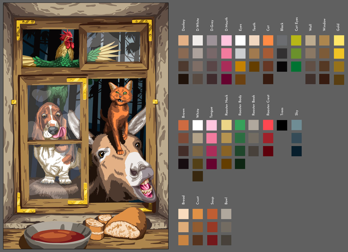
The template — vector artwork created in Adobe Illustrator — is on the left. The squares on the right are all of the colors that make up the template. Each square will be one fabric in the finished quilt.
Now that you see how the finished design looks, let's back up and talk about the color decisions I made to get to this point.
Decision 1: The Donkey's Mouth
My first color decision had to do with the color of the donkey's mouth.
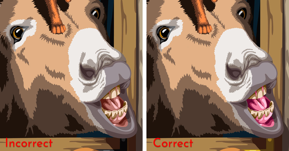
I originally designed the donkey's mouth — his gums, tongue, and cheeks — to be a dull pink. In the final version of the design, I brightened his mouth to a much more vivid pink, matching the colors of pink used on the dog's tongue. I made this change for two reasons:
- Aesthetically, using a brighter pink makes the donkey look healthier, especially because that pink was already used for one of the other animals' tongues.
- Matching the donkey's mouth to the dog's tongue meant I had to pick out four fewer fabrics, which made my job easier. I was already faced with having to choose around 80 fabrics for this design, so eliminating four of them was a welcome update.
Decision 2: The Rooster's Feathers
I debated long and hard about the color of the rooster's feathers, even going so far as to directly solicit opinions from my immediate family.
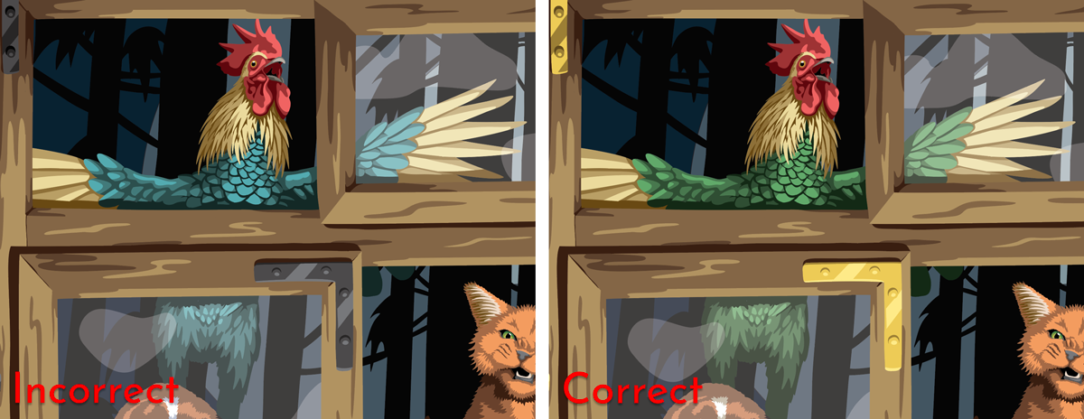
This image is being lit from a light source inside the building, such as a fire or a lantern. It's a very warm light and consequently casts a warm glow on the objects it touches. The sky and trees outside the window, conversely, are backlit by the cool, blue light of the moon.
Although I love the blue feathers, I felt the green made for better composition. The blue feathers visually tie the rooster to the scenery outside the window — the background — whereas the green feathers visually connect him to the foreground. Although the rooster is, technically, outside, I want him to feel like he's part of the group of animals clamoring at the window. To make that happen, his feathers needed to have the same warm glow that's tinting the other animals' fur. Adding a little yellow to the original blue turned the feathers green but also had the desired effect.
Decision 3: The Dog's Body
I had initially fallen back on the rule of thumb that true white objects have blue shadows and made the dog's body have blue shadows.
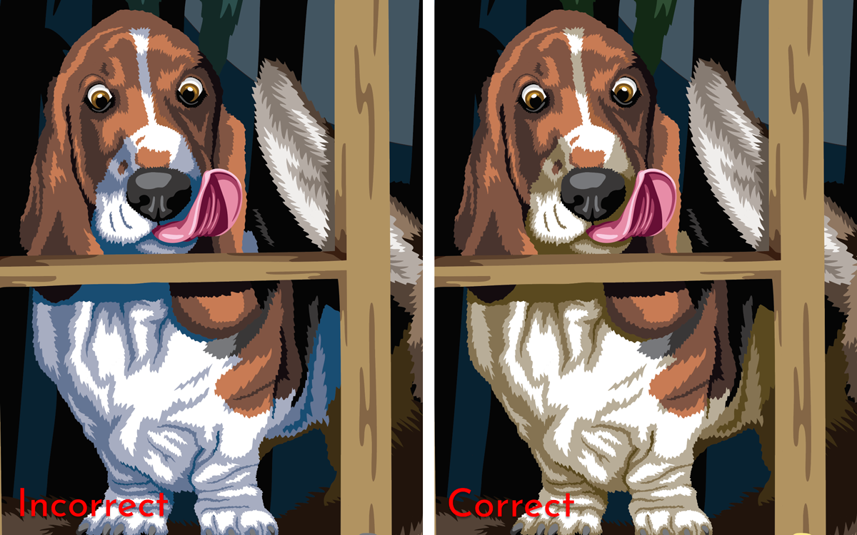
Instead of looking natural, the dog's body looked weird with blue shadows. What happened?
It all comes down to light. The rule of thumb about true white and blue shadows is correct...but only in 5000k or "daylight" lighting conditions. If I remove the dog from the rest of the image and place him on a plain, white background, you'll see what I mean:
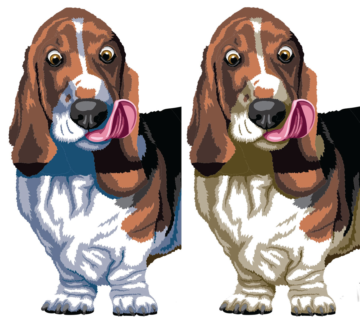
When placed on white background, the dog with blue shadows looks like a brown and white dog. The other dog, however, looks like a brown and blonde dog.
The problem in Bremen Town Musicians is that I did not design the picture to have daylight lighting. Rather, the scene is lit from a fire, which is a very warm light source. The dog with blue shadows looked out of place in my initial template design because he had the wrong lighting. Changing his blue shadows to dirty blonde made him visually fit in with the rest of the foreground imagery.
Decision 4: The Window Brackets
Last but not least, I opted to use shiny, brass window brackets instead of black, wrought iron brackets.
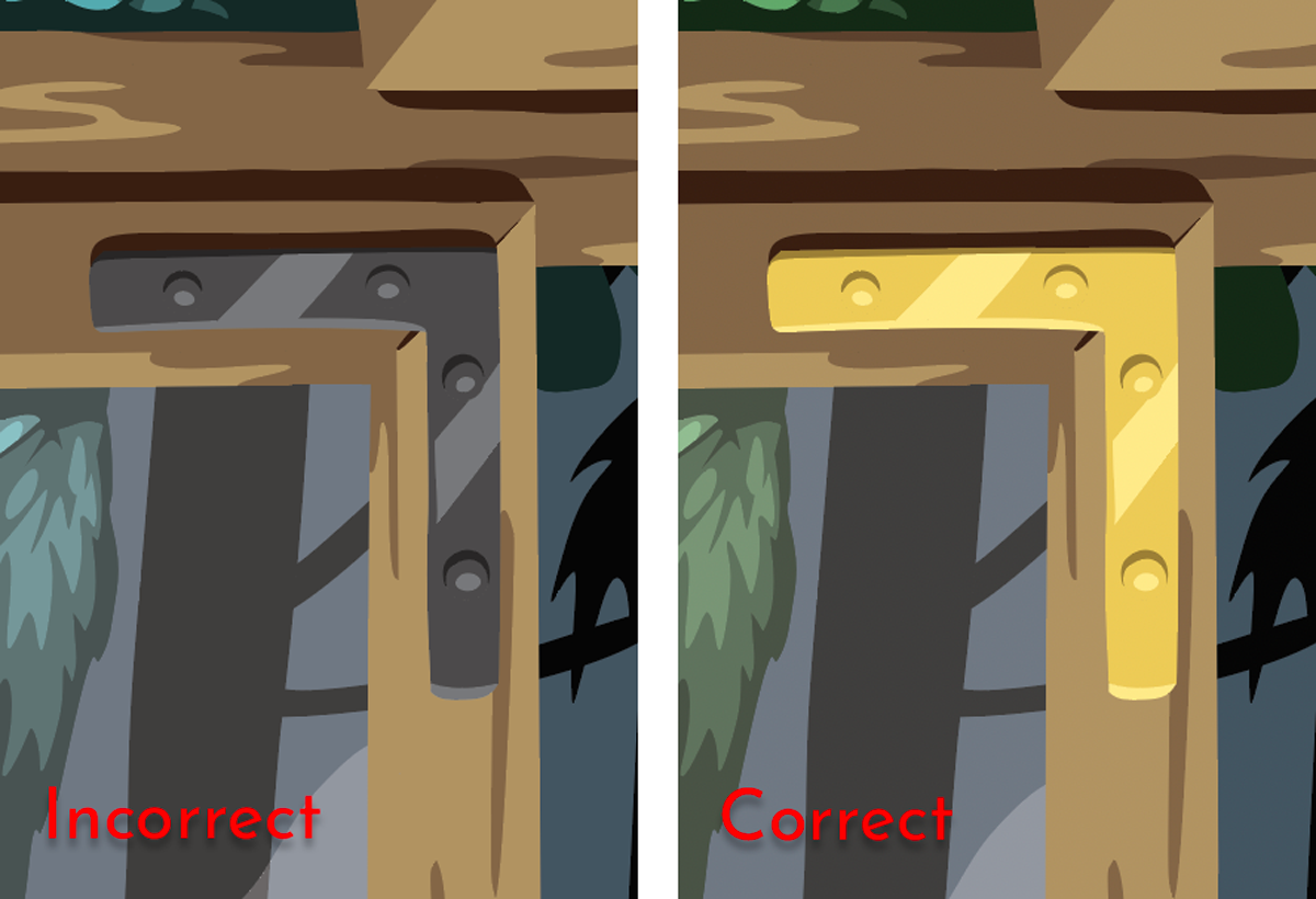
Although the wrought iron brackets would probably have been more accurate to the story — the building is supposed to be a run-down hunting cabin or farmhouse, definitely not a sophisticated residence — the yellow brackets added a sparkle to the design that really helped convey the sense of warmth. The picture feels dull without them.
Comparison
Here is a side-by-side comparison of the rejected colors next to the finished design.
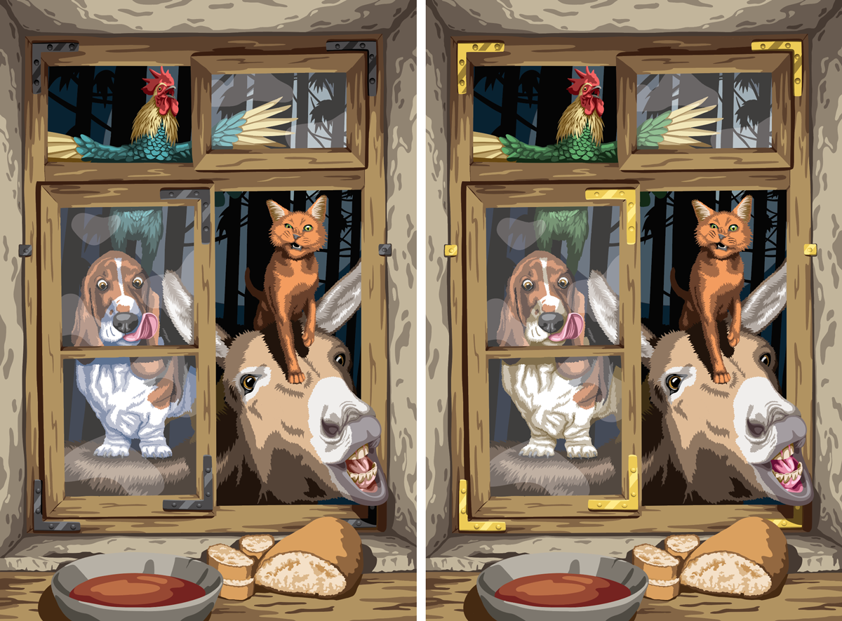
The finished design, on the right, feels like it's being lit by firelight whereas the design on the left looks like it's being lit by daylight LEDs. The deceptively subtle color decisions had a profound impact on the overall feeling and success of the image.
