Critique and Design
- Published:
- Length: 2606 words
- Reading Time: 14 minutes
Constructive criticism is an enormously important part of developing a successful work of art. As a life-long professional artist who has worked in an array of mediums, I have been through my fair share of (sometimes brutal) critique sessions. At times the feedback I was receiving was hard to hear because it hurt to hear my artwork in question wasn't as perfect as I'd thought. But I and my work have developed and improved over time as a direct result of that critical feedback.
Over the years, I've found that the best feedback comes from people who have three qualities:
- They themselves are experienced artists (or have experience with art).
- They know my style and my work.
- They have a personal relationship with me, making it more comfortable to share tough comments.
The people in my life that fit these criteria are my family members, and for this month's blog post, I thought it'd be fun to share a window into the kind of feedback they provide during the development phase of my work.
Setting the Stage
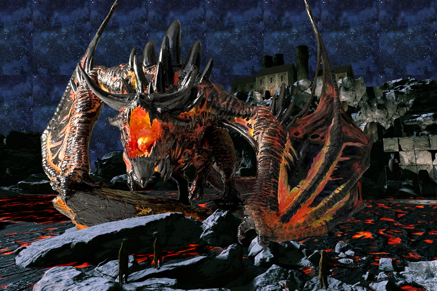
When I come up with a new quilt idea, it's entirely in my head. I can provide a verbal description of what I'm thinking, but that's all my family gets until I put together some sort of composite concept. The description for my next show quilt design is:
A magma dragon is crouching over a clutch of eggs on an island in the middle of a lake of lava. There's a cliff behind her, like the edge of the caldera, and a factory is on the top of the cliff. A conveyor line of crucibles is coming down the side of the cliff to the lava lake. In the foreground, several people in protective gear holding weapons are approaching the dragon. The working title is Profit & Loss.
I use a 3D world builder software called FlowScape to create my imaginary scenery in a visual way that gives me a good reference image to use when drawing my design. So with the above description in mind, I got to work creating that picture in FlowScape.
What follows is the transcribed text exchange between me and my family regarding the developing design. Participants are denoted by color: Me, Mom, Alex
Critique of Profit & Loss
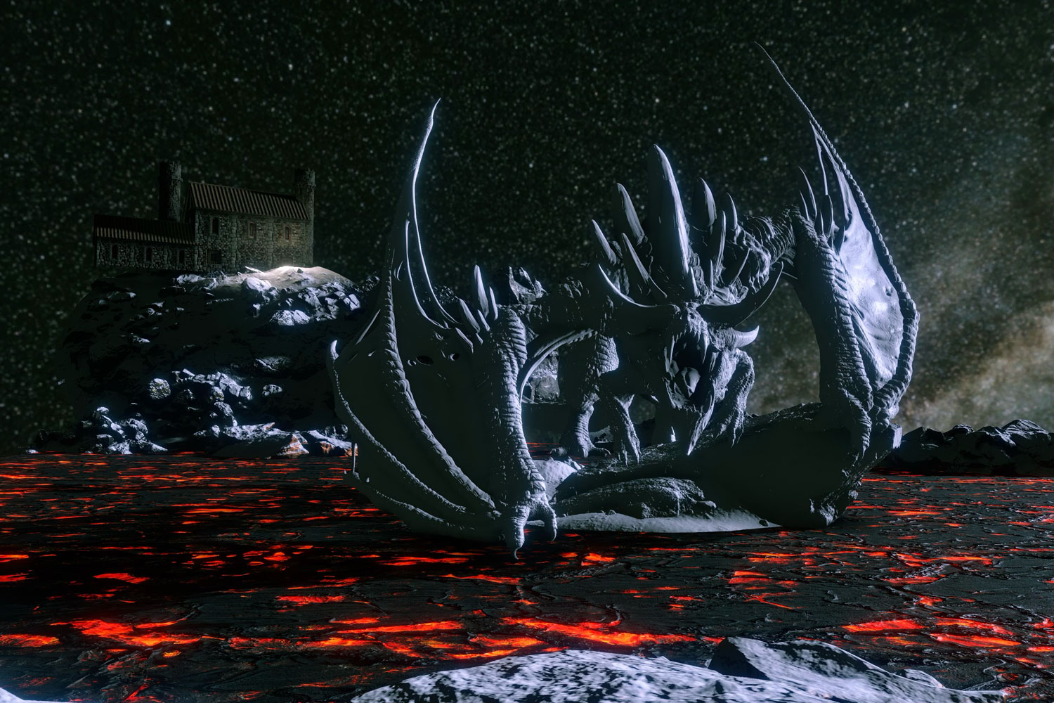
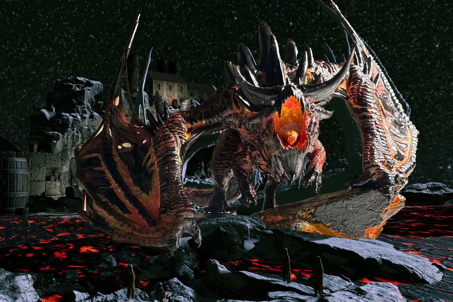
Me: First pass at magma dragon layout.
Mom: How did you get a magna dragon into flowscape? Where will her clutch of eggs be?
Me: I paid $18 to buy the model. Her eggs will be under her, like she’s crouching over them.
Me: I’m not sure how big the people in the foreground will have to be in this picture. I may need to make the factory in the background smaller so the people in the foreground can be smaller. Right now I feel like the people would need to be 2/3 the height of the whole picture to be in the correct perspective, and that’s way too big for what I want. Or maybe I just give the factory more floors, instead of the two floors it has now.
Mom: Ahh, okay I get it.
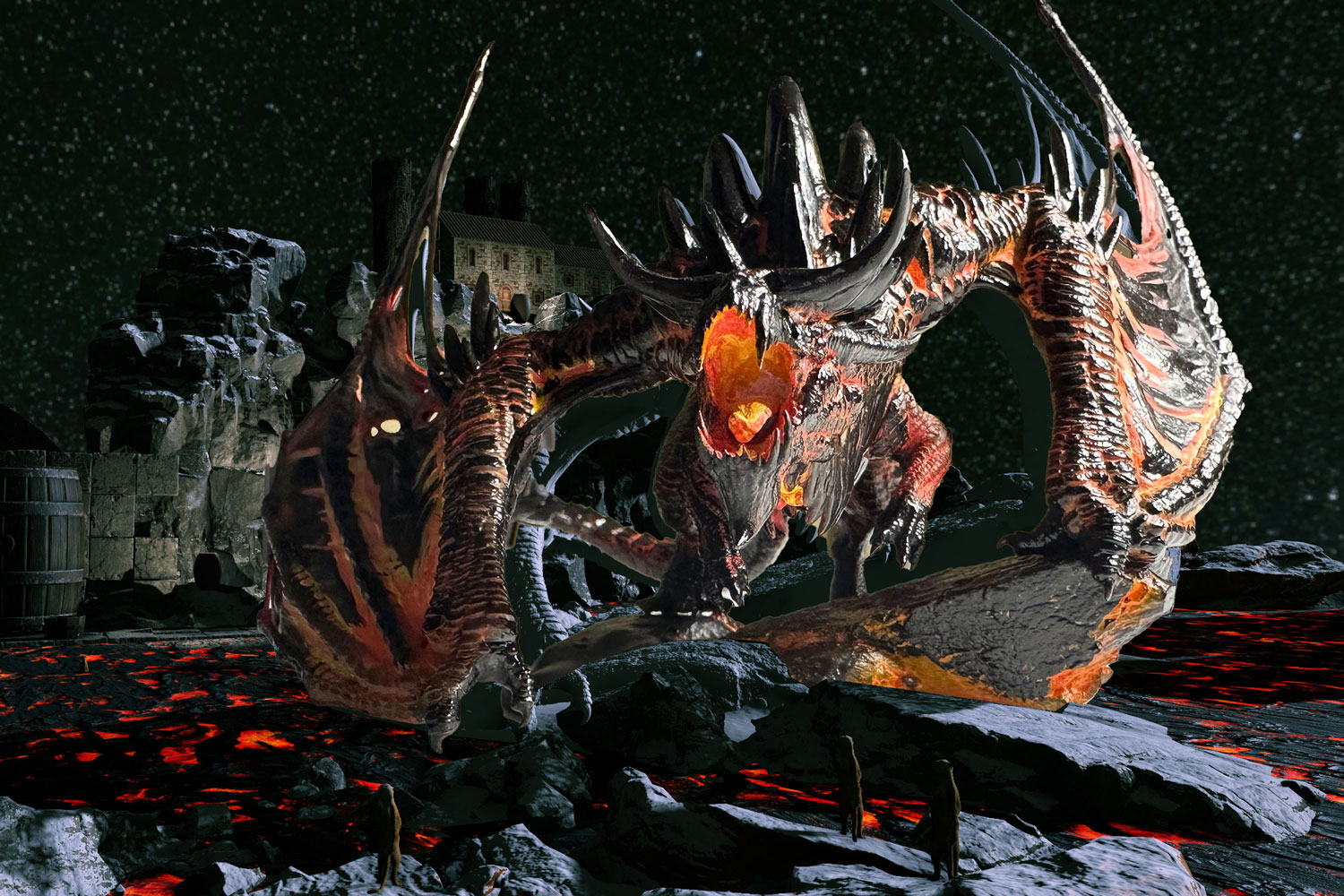
Mom: I would severely crop into this to get the dragon more in-your-face. Also, I’d be inclined to put the factory over her left shoulder in the background instead of over her right shoulder where it is presently. Thoughts?
Me: I didn’t want to crop her wingtips, but that’s probably the right move. Why do you think factory over her right shoulder instead of the left?
Mom: No. Put the factory over HER left shoulder on the right side of center. My gut says that I immediately want to look at her face. From there it’s a quick jump to look over her shoulder and see the sinister building in the back ground. Otherwise the building seems a little more disconnected from the message.
Mom: I may be reacting to how Rockwell positioned so many of his characters and the message so close together with all other details on the periphery to support his message. (Context: Mom had just been to the Rockwell museum in NY the previous day.)
Me: How about this: cropped much closer, factory goes where yellow circle is, rocky pathway connects dragon island to mainland and gives me somewhere to put the people.
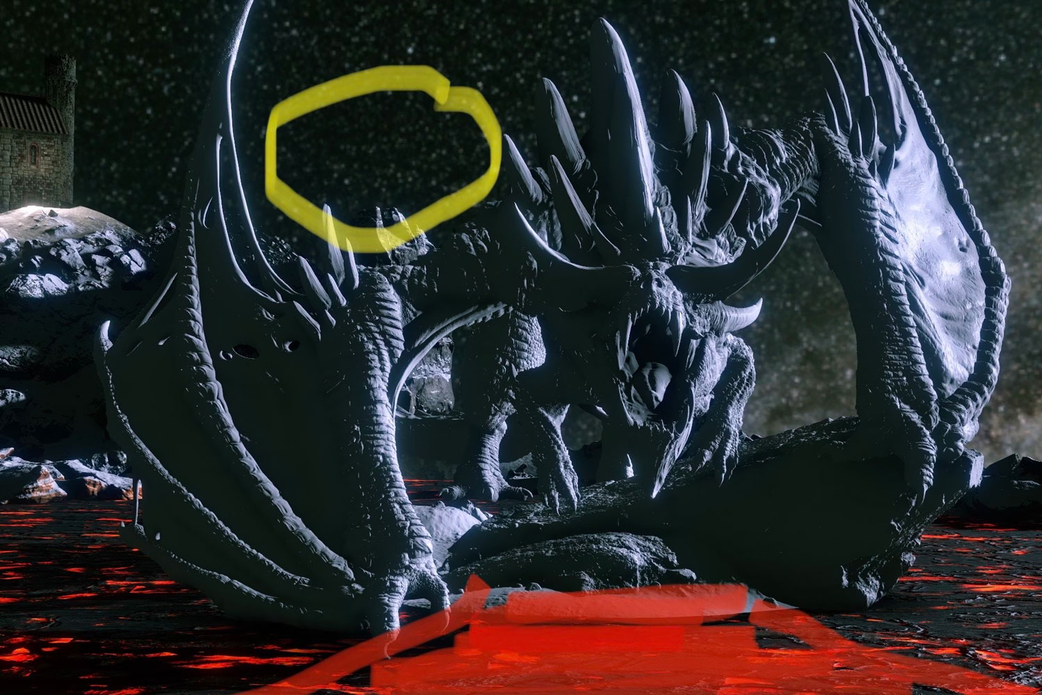
Me: She’s the entire picture now, which is very appropriate for a dragon
Mom: Yeah this is much better.
Me: How does this feel? Momma dragon is biased to the right so I have room for the conveyor and machinery to come down the cliffs to the left. People would be silhouetted in foreground. Still not sure how big they should be.
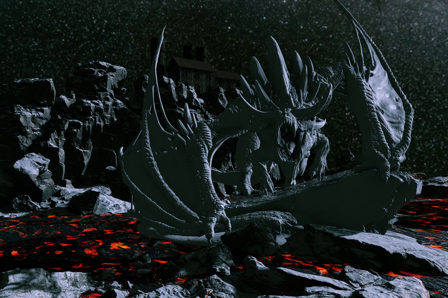
Mom: All I can say is, “ What a mind you’ve got!” Lol. It’s really looking good!
(Context for rest of discussion: Mom painted a 3D model of the magma dragon for me. I superimposed photos of that model on top of the screenshot of the digital landscape I'd created in Flowscape.)
Me: I’ve added the photo of mom’s painted dragon on top of the layout. I’m thinking pose 1, with the side of momma’s face in shadow, because her eye will be really bright and stand out. Thoughts?
Mom: Honestly, I like the position of digital dragon you purchased better.
Me: Really? Why? It’s hard to position the digital one because there’s no collision, so that one has some problems like the back legs clipping through the rocks. I was only ever intending to use it as a placeholder and use the physical dragon as the real reference.
Mom: I like the head position on the digital one. That’s all.
Me: Okay. The second photo pic has the dragon’s head in appx the same position. But I’m not a fan because the highlights are going to hold the dragon’s eye. Her eye will stand out if it’s in shadow, and the only way to do that is in photo pic 1.
Mom: Okay. I get your point and agree. But I would turn the dragon’s head a little bit more so we see more of the side of the head.
Me: Hmmm. Okay.
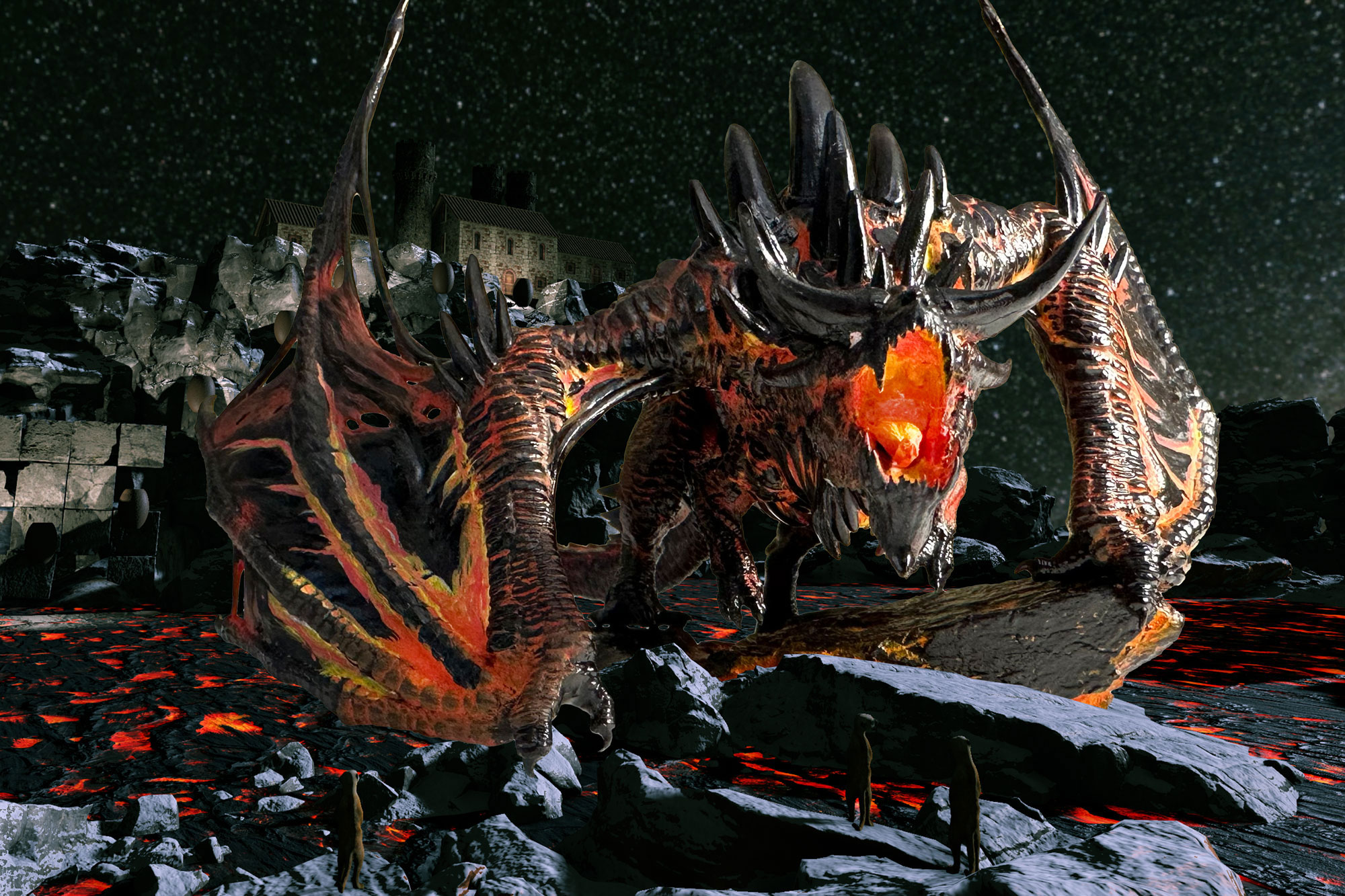
Mom: It’s subtle, but I liked the position of the body better in the previous shot. I realize the model is stiff so you can’t rotate the head. But in my mind a better position would be that earlier shot but with ONLY her head turned more to the right and have her threatening a man on the shiny flat gray rock over on the right.
Me: See, I was kind of liking the body position in this one better. She’s crouched lower. It feels a little more defensive, which would be natural considering she’s protecting a nest. I agree that the people need to move a little bit more to the right, so that she’s facing them.
Mom: Okay yeah maybe that’s all that needs to change.
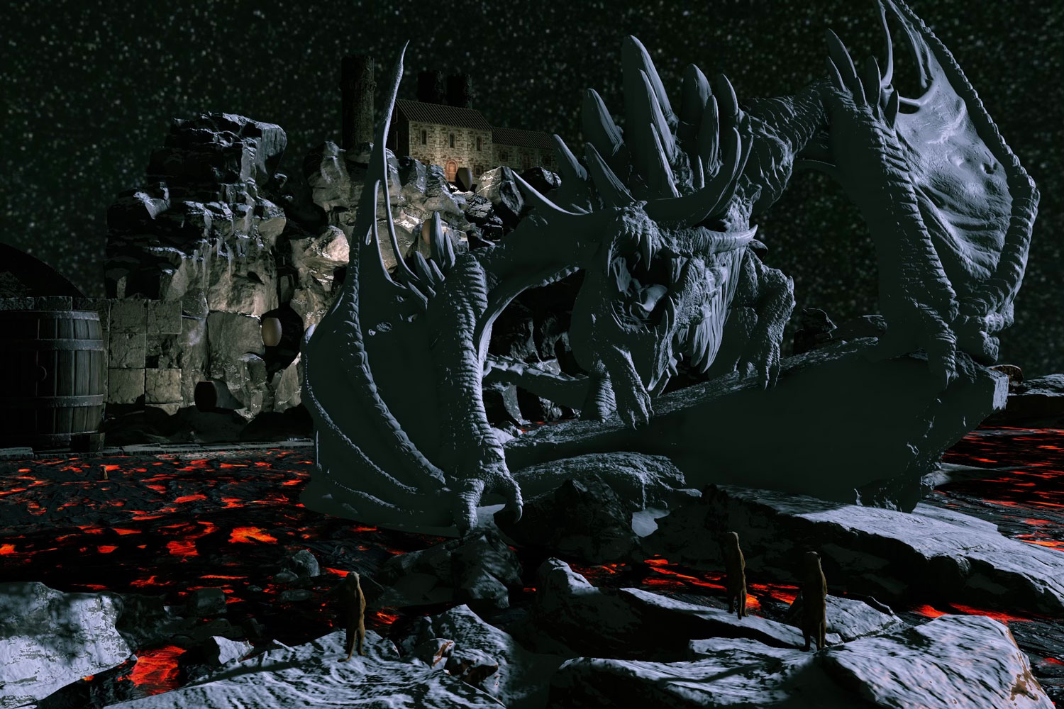
Me: No changes here other than I dropped a new sky. This is the fabric I’m planning to use, that Timeless Treasures print I bought a bolt of.
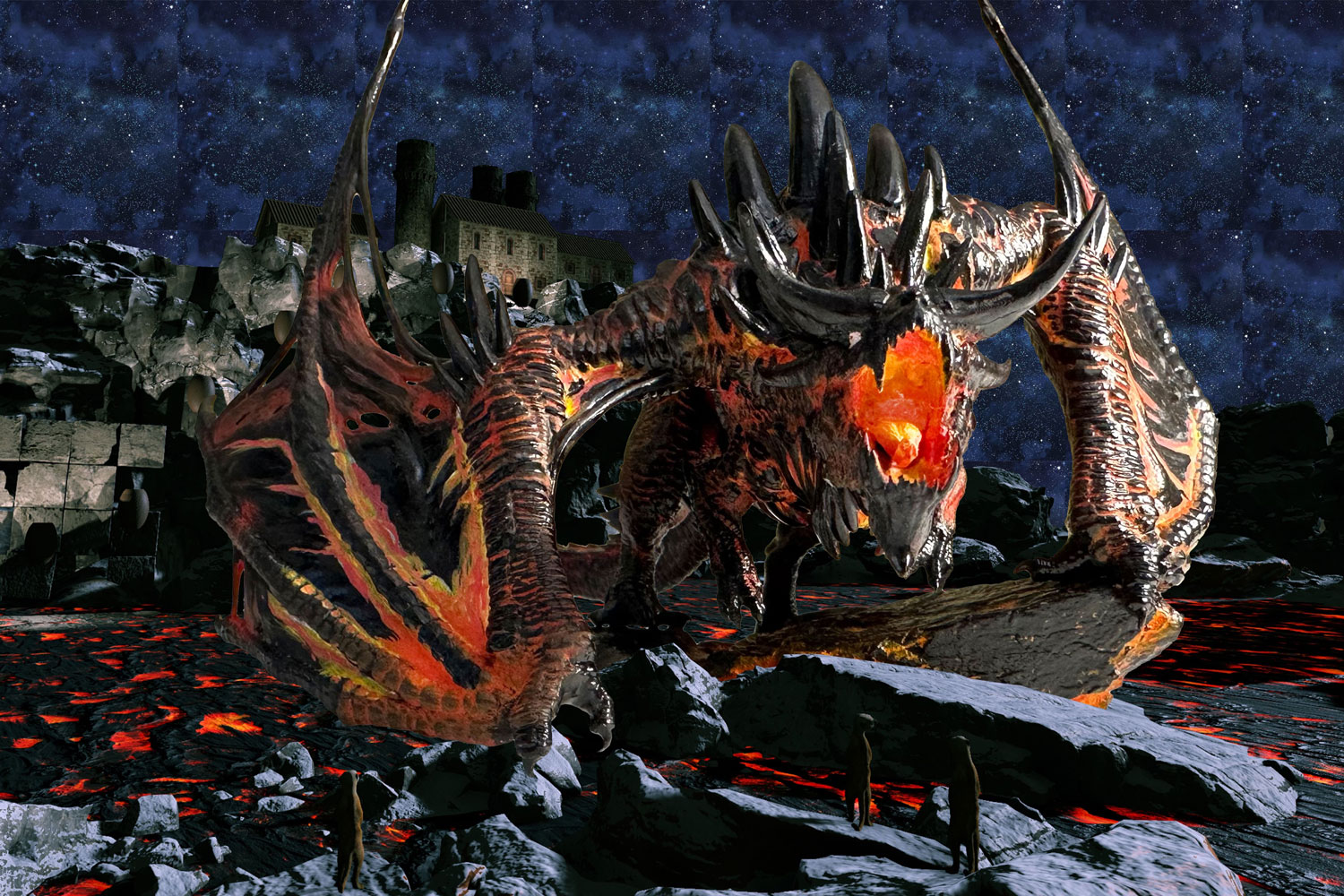
Me: Sooo...what do you think about this?
Mom: Why did you change it?
Me: Because people read from left to right. If momma is facing left, the action/most dramatic part of the scene is the first thing people will see. The rest of the story with “big brother” factory is secondary, looming in the distance.
Me: This feels more direct. The other way made the viewer take in the secondary story before getting to the action.
Alex: i was actually going to say the left-to-right thing is actually why i don’t like this as much, because the first thing i see is the dragon and it’s pointing in a less natural direction
Me: What do you mean “less natural”?
Alex: i don’t really know if i would say i process photos the same way i process text, but having the dragon facing right just feels better to me. i’m not sure why, i just thought it might be the left-to-right thing.
Me: When you say “feels better”, do you mean calmer or settled? Because I wouldn’t mind putting a viewer off-kilter with this scene. It’s not a comfortable story.
Mom: I agree with Alex 100%. I was uncomfortable with the new reversed look. When Alex said what he said I remembered what we learned in marketing. People’s eyes actually tend to follow an S pattern when looking at art. Usually the top right is the first place the eye goes and then sweeps down in an S pattern. I think that may be why I liked the original direction.
Me: So in the original direction, you’re saying you look at momma’s head/mouth first, factory second, and people in foreground third?
Mom: Exactly. I do.
Me: What about in the reversed layout? Where do you look 1st, 2nd, 3rd?
Me: I’m really curious about this because I agree with the both of you that the original layout feels “better”, but I’m kind of loving the reversed version because of how unsettling it is. The conflict here is supposed to be unsettling.
Alex: i honestly don’t think i'd change what i look at first/second/third, it just doesn’t feel as natural.
Mom: My brain is a bit confused. My eye keeps going back and forth between the dragon’s head and the factory. It takes me longer to look down at the bottom where the people are. My head just feels confused.
Alex: i always look at the dragon’s mouth because it’s a big, bright, colorful area.
Alex: and then i look up towards the factory because the dragon’s body points that direction and it’s the biggest dark space.
Alex: and then i look along the bottom next because my eyes haven’t been down there.
Mom: I’m not so much unsettled by the new layout. I just find it harder to figure out what the story is.
Alex: yeah, i don’t think i would describe what i feel as ‘unsettled’ either.
Alex: anyway, i don’t think it facing left is bad, i just think it looks better facing right.
Mom: Ditto that. What he said.
Alex: if you guys are interested in the study of this stuff, i found this paper that seems pretty interesting: https://www.frontiersin.org/articles/10.3389/fnhum.2011.00098/full
Alex: i think a TL;DR is that what we look at depends on a few different things and will change depending on the composition, but they have a few examples in the paper that might be interesting.
Alex: there’s also this one that focuses on van gogh’s artwork specifically: https://pdfs.semanticscholar.org/d33d/ebd02397e814fab205f411e3b4b5d04e1d27.pdf (this took me like 5 minutes to find a copy of, since it’s not published publicly…but, i think this site screwed up and got its copy indexed by google)
Mom: Thanks, Alex.
Me: Thanks!
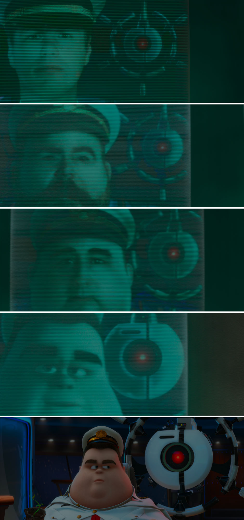
Me: This is so interesting 😂 Okay, how about this. In the reversed image, I’m getting much more “factory/big brother/overarching villain” vibes with the factory in the top right, looming over her shoulder. Interestingly, this is also the position of Otto (Auto?) in the photos behind the captains in Wall-E. Otto is over the captains’ right shoulder and he’s getting progressively larger in each picture, implying he’s taking over more control of the ship ie. his influence is getting stronger.
Alex: i’m going to be honest, i think the dragon is so big and menacing that it’s hard to see the factory and the people as the villains that are taking over.
Alex: i actually think you’d want to do something to make the dragon seem small if you wanted it to feel like the dragon was vulnerable/not fighting on even footing.
Alex: like i said awhile ago, i think the main story i get from the picture is how poorly the factory owners treat the employees (overworked, being sent to their possible deaths to deal with this ‘nuisance’ of a dragon) and the whole “oh no, nature is being pushed to the brink” thing is secondary
Me: Momma is what she is, and she’s going to defend herself, but she didn’t start this fight. The people did, and ultimately it was the fat cats in the factory board room that gave the order.
(This was the end of our text discussion, but we had a few conversations verbally with additional points I'll add below.)
Verbal Discussion Points
- The lava should be emitting reddish light onto the rocks and people nearby.
- Momma dragon is emitting light herself.
- The people will be fully covered in suits a la 1800s divers or hazmat style. This is intended to be heat protection.
- The people will have weapons. One person will be firing on the dragon. The others will be cowering, or looking hesitant, etc. Since no faces will be visible, the peoples' gestures and body language will have to communicate to the audience.
- Possibly use red tulle to add a haze between dragon and cliffs/factory in background.
- Sky needs interesting quilting. Possibly do the Milky Way?
Conclusion
Hopefully this window into what goes on behind the scenes when I develop new artwork was as entertaining as it was informative. At this point, my design is roughly 90% solidified. I need to add 2 more people, figure out the peoples' gestures, swap people in for the meerkats, and figure out how to quilt the Milky Way in the sky. But it's close enough for me to start drawing the template, so that's what I'll be doing over the next couple of weeks.
