Drawing What We See
- Published:
- Length: 359 words
- Reading Time: 2 minutes
Learning to draw what we see — not what we think we see — is a tough lesson for all artists to learn. Even with years of practice under my belt, I still catch myself falling into that trap, and my latest quilt design was no exception. Let's talk about Lucky's tongue.
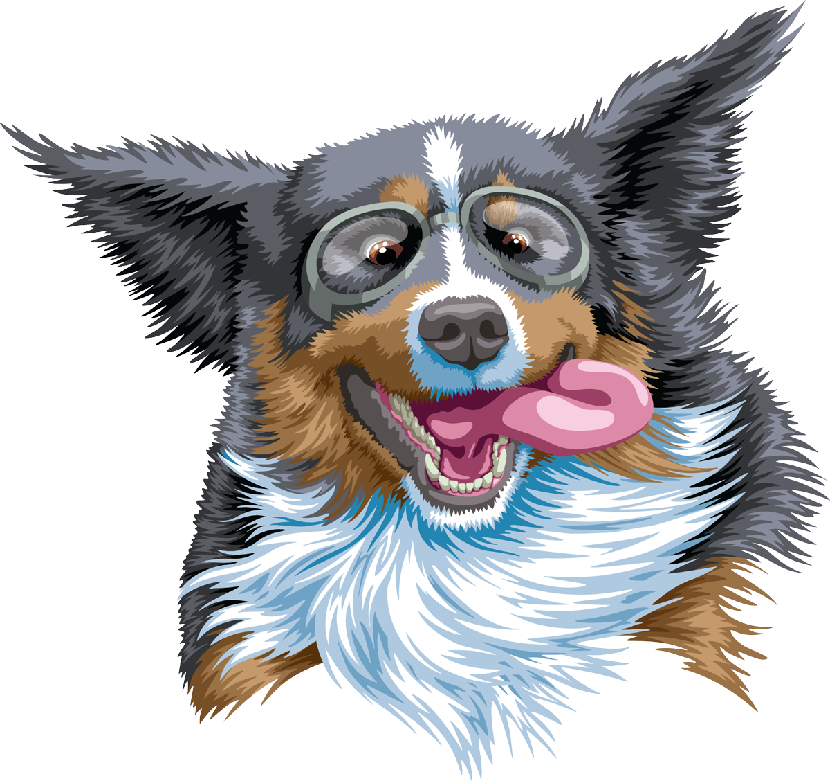
Lucky is the name of the Bernese Mountain Dog who stars in my newest quilt. I'm still working on the overall design, but most of my drawing efforts so far have been concentrated on bringing Lucky to life. Here was my first-pass drawing of Lucky's face:

On initial glance, Lucky looks pretty good. He's clearly a happy dog presumably flying through the air, thanks to the flapping ears and goggles. But the longer you look at his picture, the more something doesn't feel quite right. His tongue looks like a human tongue, not a dog tongue. What's going on?
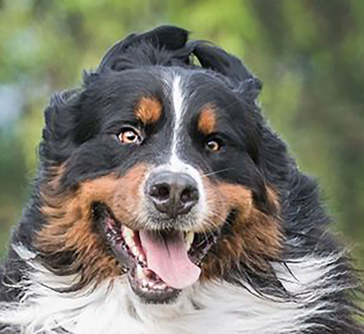
This is the reference photo I'm using to draw Lucky's face:

In this photo, the dog's tongue is falling naturally out of the front of his mouth. In my design, however, I wanted his tongue to be flying out to the side. I had to make up what a dog's tongue would look like in that position, and the result was a human-like tongue instead of a dog-like tongue.
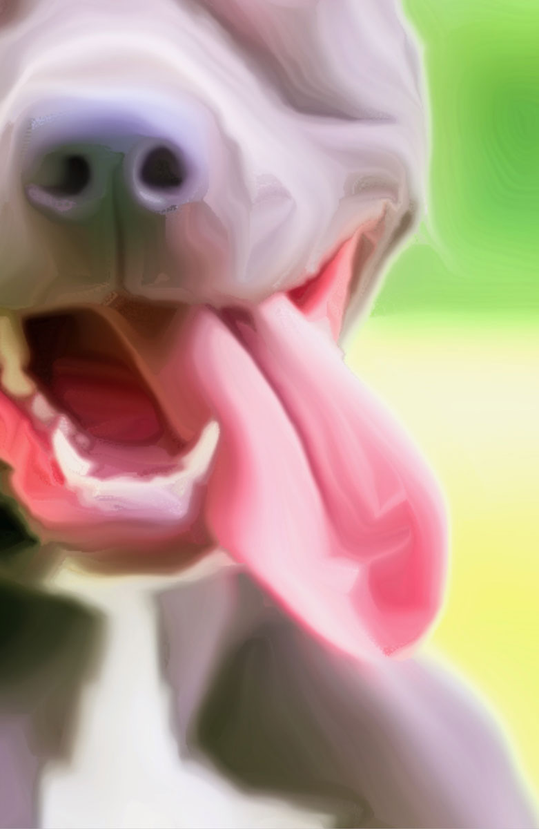
To fix the problem, I went looking for another, more accurate reference. This close-up was run through a paint-like filter on an app to help simplify the colors, but it clearly shows factors that make a dog's tongue look like a dog's tongue.

This tongue looks thick and substantial further back but flattens out at the tip. It's not bulbous or rounded on top, but it does have a triangular bump in the center caused by the way the tongue is bending.
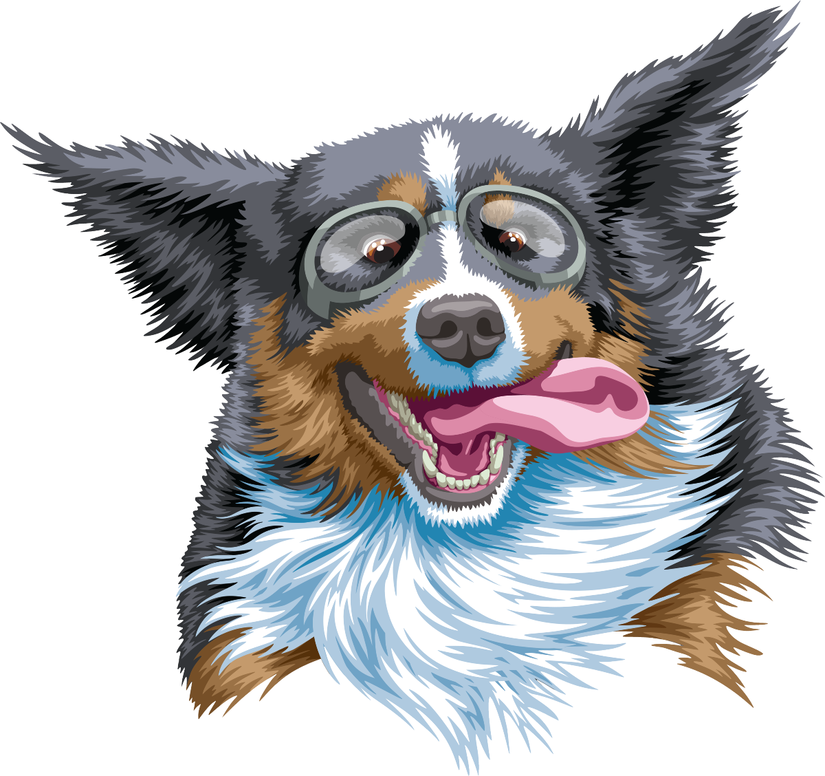
I re-drew Lucky's tongue using this new reference, paying extra attention to the qualities I just listed, and here was the result:

Much better!
