Shaping the World for Good Composition
- Published:
- Length: 550 words
- Reading Time: 3 minutes
Sometimes, I use a program called FlowScape to build my imaginary settings. Flowscape is a sandbox-style computer game in which the purpose of "playing" is to build virtual worlds. Users can add foliage, fauna, ground texture, elevation, and have complete control over lighting and atmospheric effects.
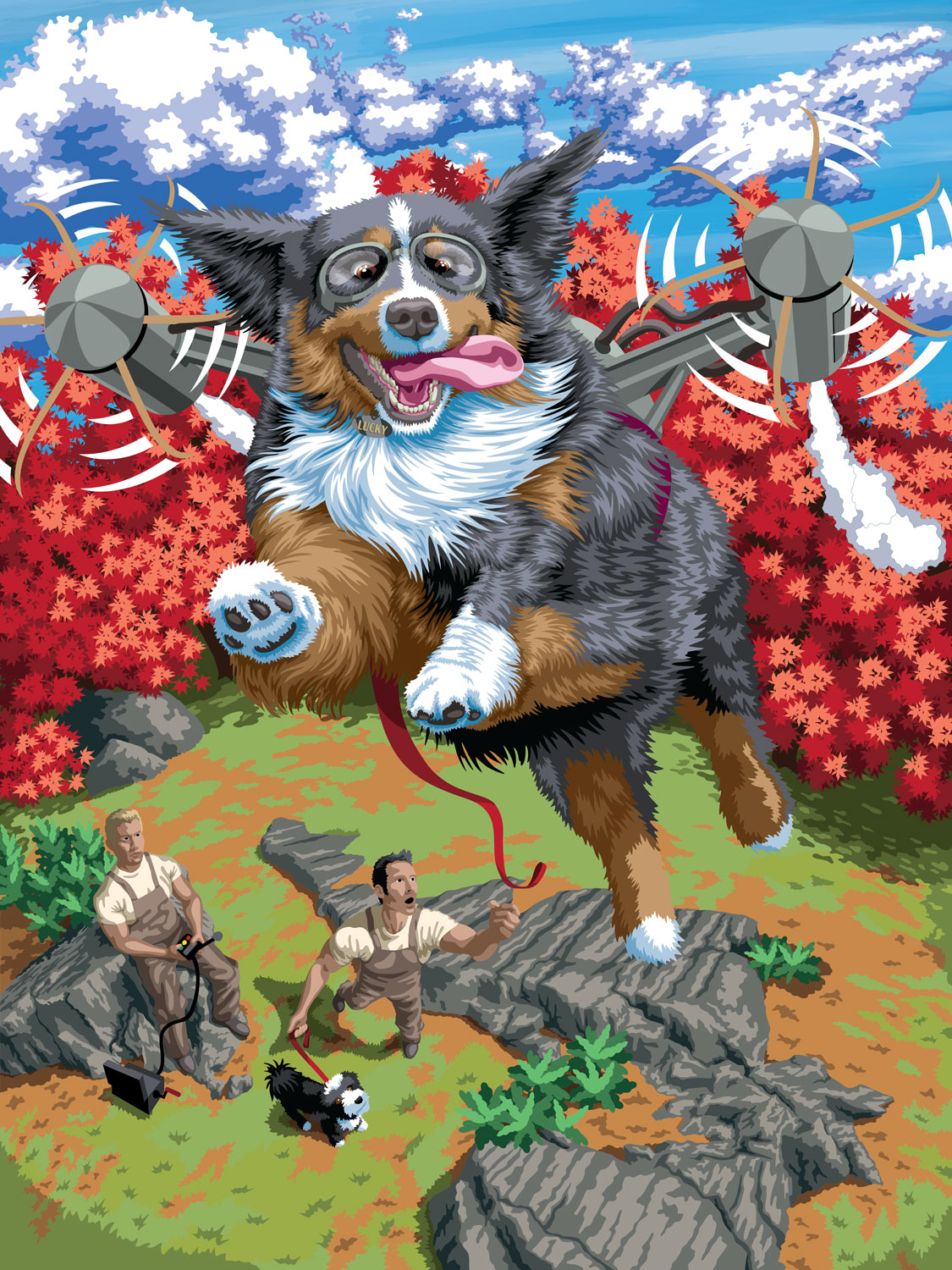
I used FlowScape to build the scenery behind Lucky, the flying dog, in my newest quilt design, The One That Got Away. Let me take you through my process of designing a scene in FlowScape to in turn create a successful quilt composition.
Attempt #1
My idea was to have Lucky flying over a sort of park or clearing. There had to be room below for his owners to be standing, but I also wanted to have a backdrop of green pine trees in the back. This was my first scene:
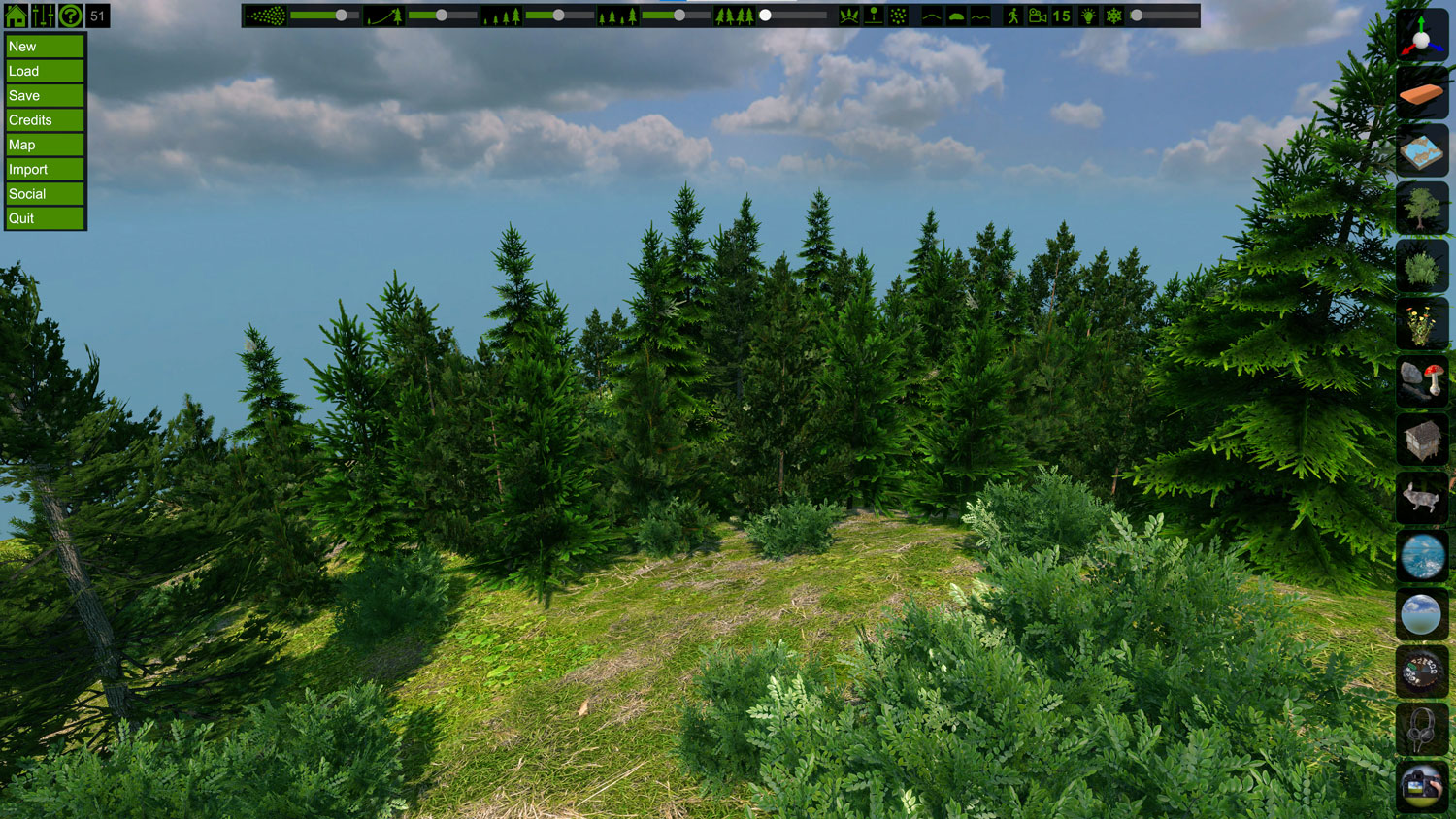
I cropped this scene to the needed size and dropped the photos of the people I'd taken using my figure models on top, along with a sketch I'd done of Lucky. This gave me a feel for the overall composition.
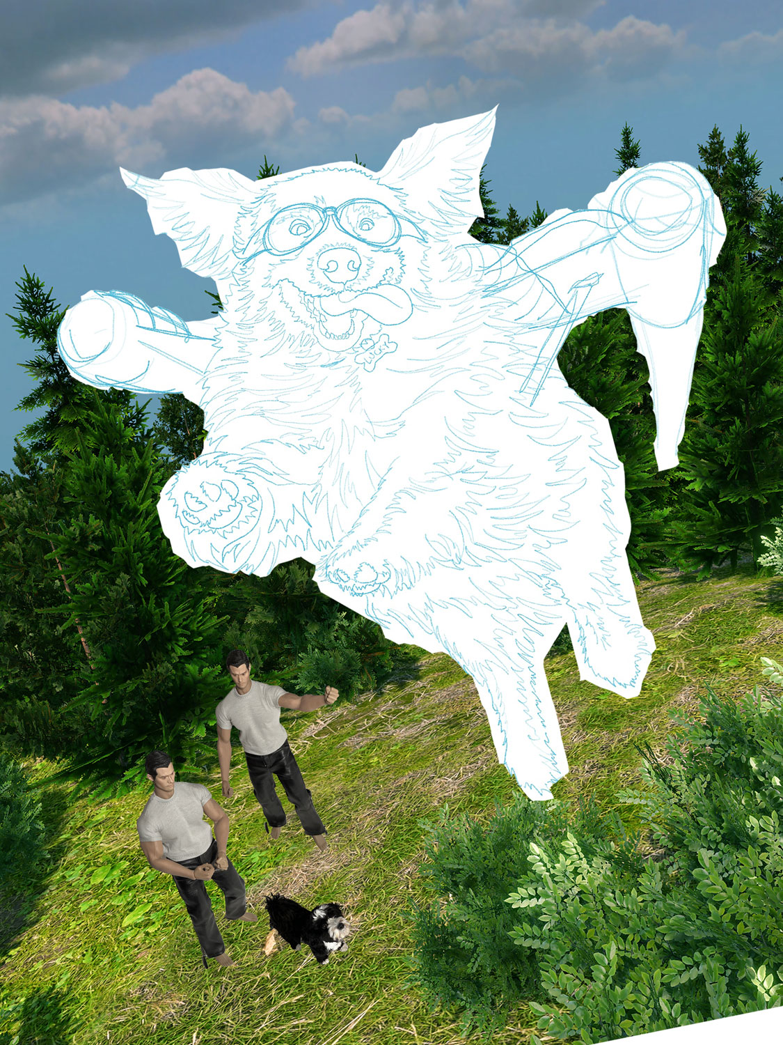
I scraped this idea almost immediately; it was too green. Compositionally, the background was uninteresting because it felt all the same. Technically, I was going to have trouble sourcing that many different green fabrics that all met my personal criteria for good design. The pine trees had to go.
Attempt #2
I made a new scene, this time with rocks in the foreground and autumn Japanese Maple trees in the back.
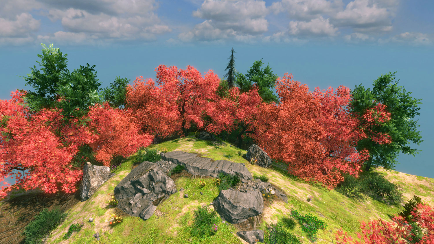
This felt much better! But how did it look in the composition?
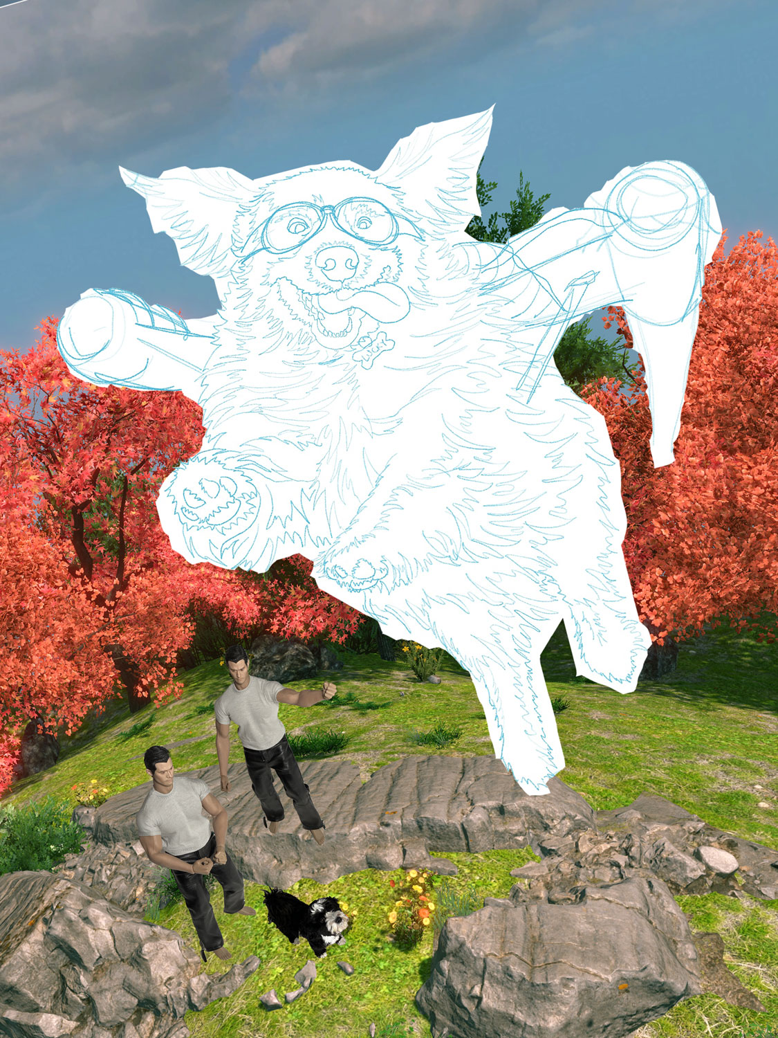
Although I really liked the red trees in the background and having more stuff going on in the foreground, this design still had some problems.
- I didn't like the camera angle. It was too "tame". I wanted a higher, much more dramatic angle to make the viewer really look down on the people in the background.
- The sky needed some interesting clouds.
- I didn't like the position of the rocks. They seemed to cut horizontally across the image, which was making me feel like they were a wall blocking off the bottom 1/3 of the design. They prevented my eye from moving easily through the composition, and that had to change.
Attempt #3
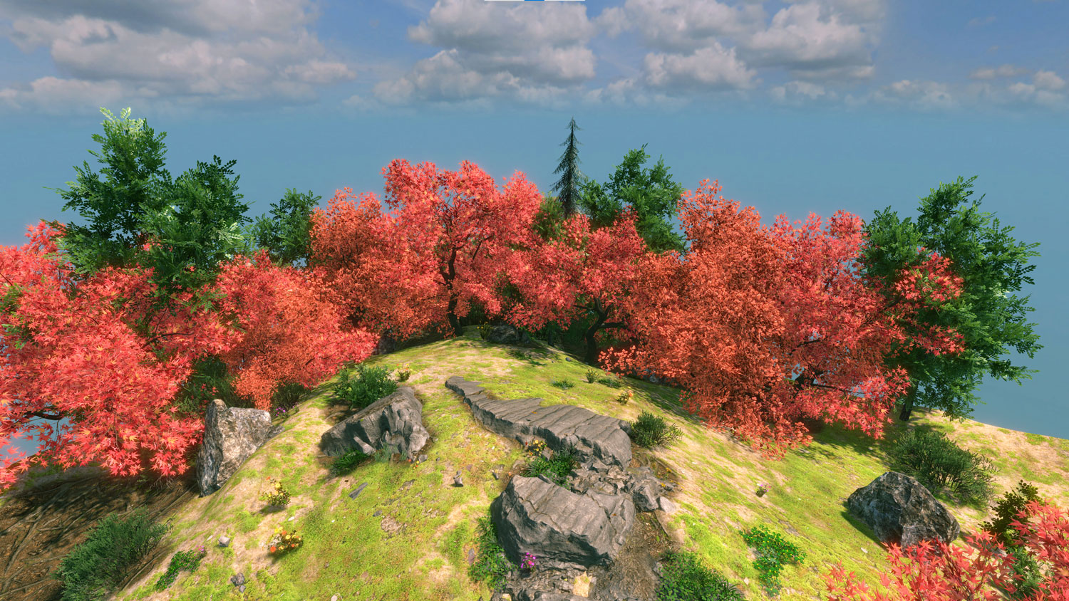
I went back into FlowScape to reposition the rocks and adjust the camera angle. I also took a separate screenshot of the clouds.
I once again dropped the FlowScape scene behind my people and the dogs.
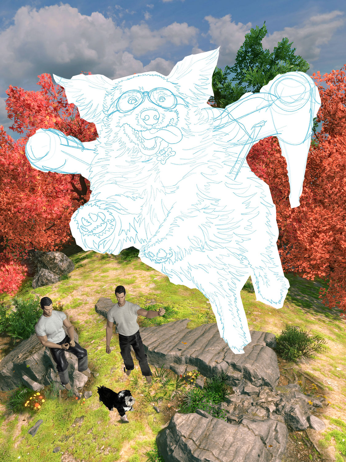
See how the position of the rocks now leads the viewer into the picture? What's more, they look like they're forming a path that the men could have walked down to get to their current location. I also was much happier with the new camera angle and the clouds in the sky.
The screenshot above is the image I used as the basis for drawing the template (below).
