It's the Simple Things - Like Shadows
- Published:
- Length: 559 words
- Reading Time: 3 minutes
When designing a realistic scene, adding a shadow under an object makes it feel like it has mass and is actually resting on whatever surface it's on. It's a simple solution for a pretty common situation. But sometimes implementing that solution isn't quite so straightforward.
Let's take a look at my most recent quilt design, Arcane Snap, in which shadows go a long way to selling the believability of this fantastical scene.
No Shadow = Bad
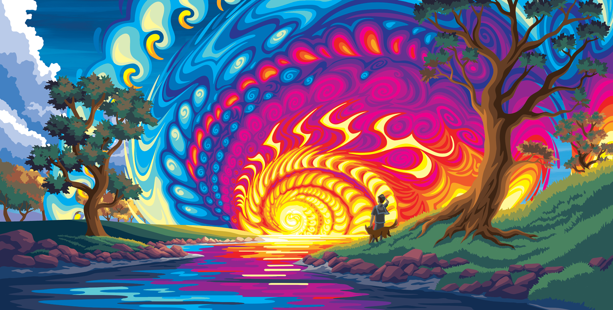
We're specifically going to look at the boy & his dog and the big tree on the right. Here's what the design looks like when those objects don't have shadows.

To be fair, there's a small amount of darker grass around the roots of the tree, but that's it. With a light source as close and bright as the center of the spiral, I would expect a very dramatic cast shadow. As a result, neither the boy & his dog nor the tree really feel like they're a part of the scene.
Why do we know the center of the spiral is emitting light and therefore those objects on the right should have cast shadows? Because the spiral is changing the color of the grass and water as it gets closer to the center. It's also changing the colors of the tree leaves. It wouldn't make sense to have these changes and NOT have cast shadows elsewhere in the design. One exists, therefore the other must as well.
Shadow Is Too Light
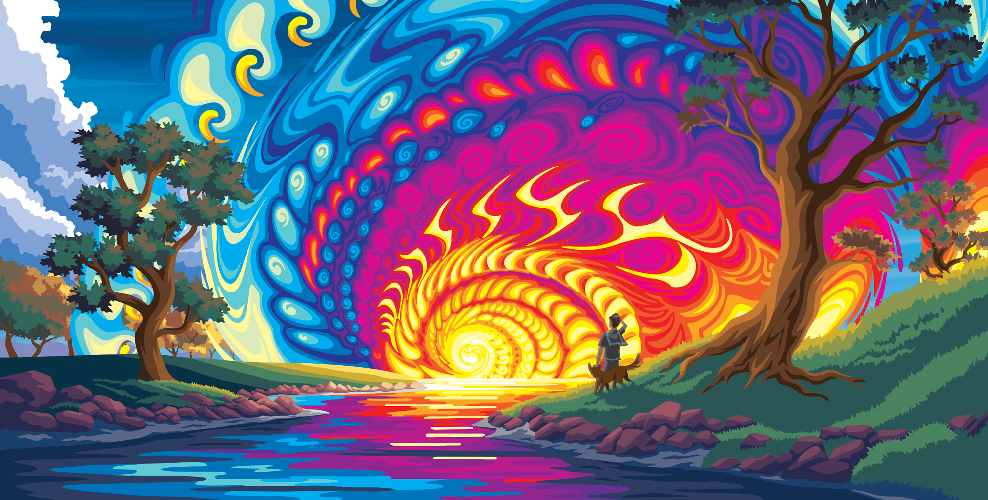
In this version, I've added cast shadows, but they're still not correct.

These cast shadows don't feel correct because they aren't dark enough. A good rule of thumb is that shadows should have similar levels of value. Look at how dark the shadow in the bark of the tree is compared to the cast shadow on the grass. If the bark gets that dark in absence of light, parts of the grass should as well.
The same idea applies to the boy and the dog. Their shadows (those present on their bodies and clothes) are a darker value than the grass. The result is that all of these things (the dog, boy, and tree) feel like they're not appropriately anchored to the design. They're not truly floating, but they don't really belong, either.
Good Cast Shadows
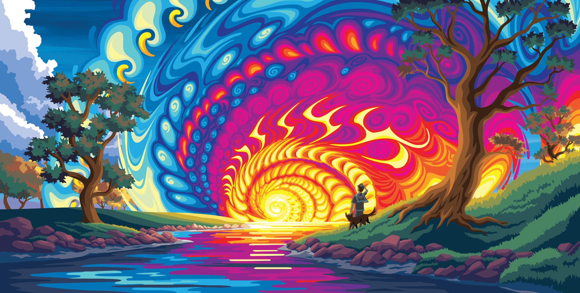
Adding a dark core to those cast shadows (which meant adding a fifth value to the progression) was the solution. Now the boy & dog and the tree all feel like they have mass and belong in the scene. The darkness of the shadows also emphasizes just how bright that center spiral really is.

Just For Fun
I removed the cast shadow from the boy & his dog but left the one by the tree. This really goes to show how the shadow helps "anchor" an object to a scene. The boy and the dog feel pasted in whereas the tree feels intentional.

Shadows are one of those things that everyone knows about but can still be tricky to get correct. I hope this look at how I designed cast shadows into my design provides some food for thought in your own artistic endeavors. Happy creating!
