Troubling Tangents
- Published:
- Length: 856 words
- Reading Time: 5 minutes
Tangents are a design mishap that I'm always working to avoid in my art. They come in a variety of forms, but there are a couple in particular that seem to routinely appear in my designs. In this post, I want to talk about nine different types of tangents, refer specifically to the types that I encounter most often, and share what some of my quilt designs would have looked like if I had not actively removed tangents from my art.
Types of Tangents
Outside of art, "tangent" generally refers to two objects that are touching. When it come to design, "tangent" means objects that touch in a way that is visually bothersome. For me personally, I find that tangents sneak into my art because I'm working on combining so many different elements into the same composition. I often need to take a mental step back from my work in order to asses whether I've inadvertently added one.
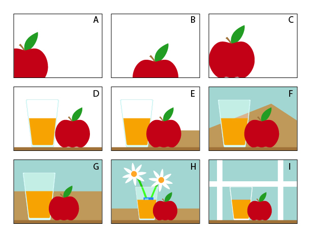
Here is a chart of some of the most common types of tangents in art, followed by a list that explains them:

A. Closed Corner: A shape covering a corner of the composition isolates that corner from the rest of the design. Fix by changing the position of the object or the crop of the composition so the tanget is not so distracting.
B. Halved Shape: A symmetrical object cut off by an edge of the design gives viewers an uncomfortable, chopped-off feeling. Fix by moving the object entirely into the design, or by changing the portion that is cropped.
C. Fused Edges, Frame: Objects touching the edge of a composition feel awkward and crowded. Fix by moving the object(s) entirely into the composition or cropping some portion past the edge of the design.
D. Fused Edges, Shapes: When the edges of objects within a composition touch, it creates an awkward, crowded sensation for viewers. Fix by moving the objects apart or overlapping them.
E. Hidden Edge: When the edge of one object is hidden behind another, the information of where the first object ends is hidden from viewers. This can make the two objects feel joined together. Fix by changing the composition so the hidden edge is visible.
F. Split Apex: A vertical shape aligning perfectly with other objects causes strange, unwanted symmetry within a composition. Fix by changing the composition so that those shapes do not align.
G. Stolen Edge: When the edges of two shapes align perfectly, it creates a sense of ambiguity for viewers. Fix by creating a more obvious overlap so the edge is intentionally obscured or ensure both edges are visible.
H. Antlers: Clearly-defined vertical shapes positioned directly behind an object can appear to be growing out of the object in front like antlers. Fix by repositioning objects so that the distinct vertical shapes are not perfectly aligned with objects in front. Alternatively, adjust the value or color of the background object to visually separate it from the foreground object.
I. Skimmed Edge: When the top edge of a lower object perfectly meets the bottom edge of a higher object, the two shapes may appear to merge. Fix by adjusting the position of the object(s) so that they either do not touch or more clearly overlap.
Tangents in My Own Designs
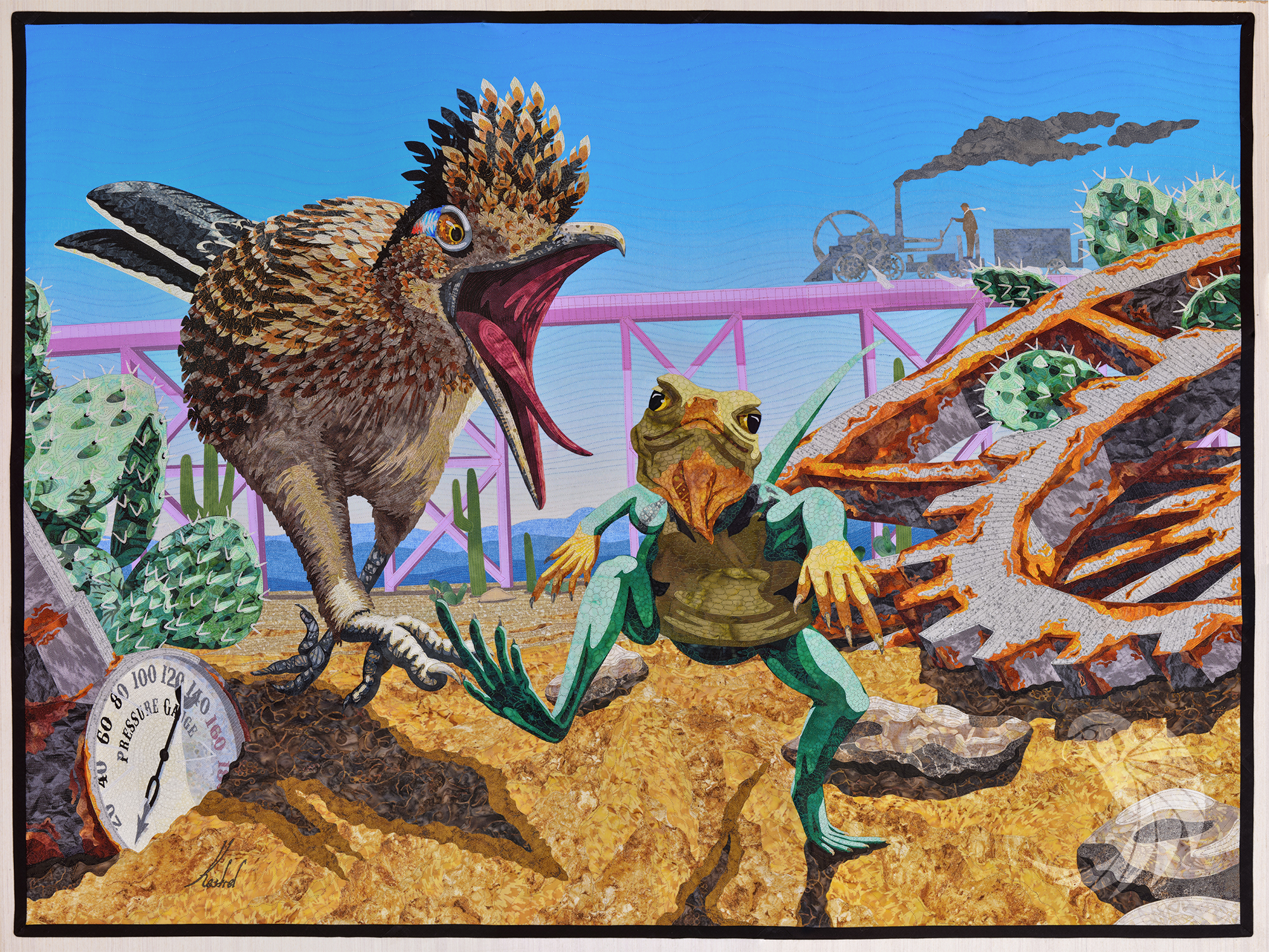
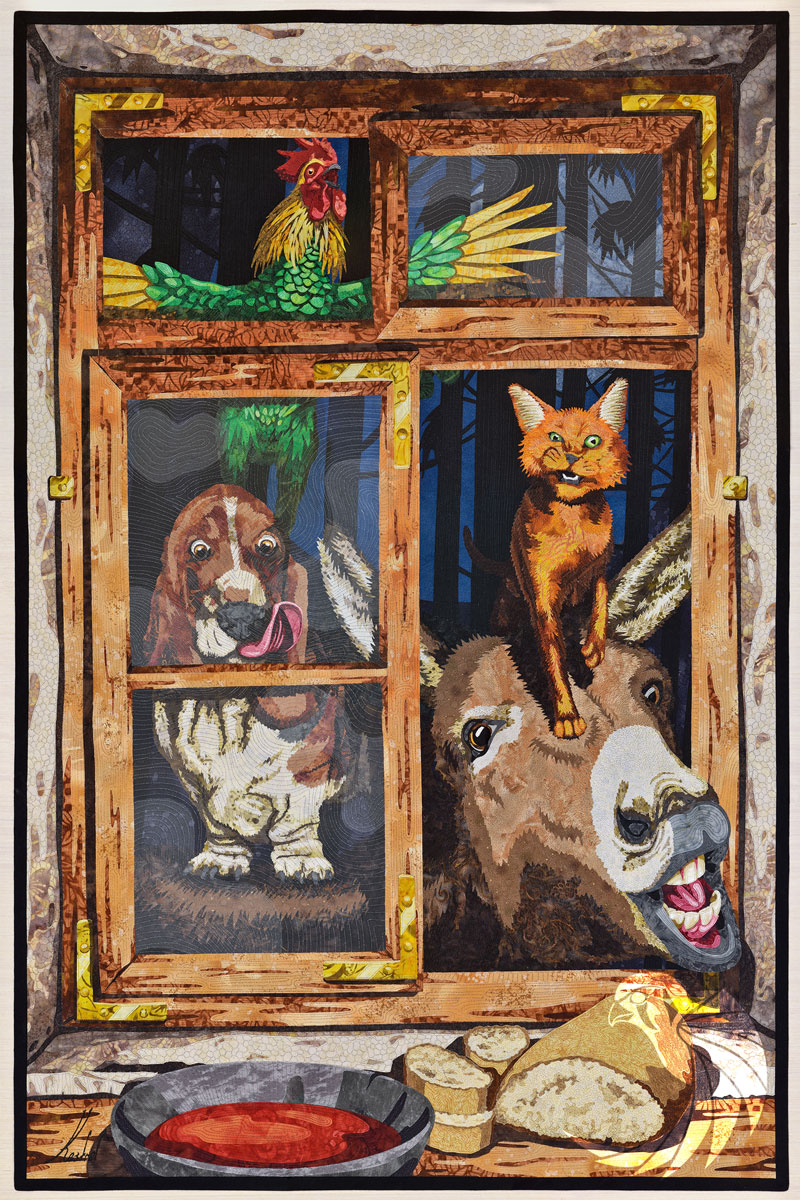
The types of tangents I find myself catching most often in my own quilt designs are those where objects are touching: Fused Edges, Stolen Edges, and Skimmed Edges. Here are some tangents that either "could have been" or that I saw and intentionally removed from two of my quilts.
Not Today

I knew I would have a potential issue with the train trestle in the background looking like it was coming out of the roadrunner's mouth. Changing the composition wasn't an option because of perspective. Instead, I deliberately chose fabrics for the trestle that were lighter in value than the roadrunner to create a sense of depth. This in turn would make it clear to viewers that there was a significant amount of distance between the trestle and roadrunner, minimizing the distraction of the tangent.
Bremen Town Musicians

This design was full of potential tangents, and I spent a ton of time subtly repositioning the animals to remove as many as possible. There's a half inch of space between the cat's ears and the window frame above him. The donkey's right ear extends past the center frame of the window and is visible on the other side. It's hard to see on this small image, but the rooster's crest extends past the lower edge of the window frame above him.
In analyzing this picture, I do see one tangent that could have been better fixed. Near the bottom, one of the cut slices of bread extends slightly into the shadow along the bottom edge of the window but does not cover any of the brown wood. At this small size, that area looks like a tangent, although it's not as noticeable in the full-size quilt.
