Illusion in Fabric Portraiture
- Published:
- Length: 1916 words
- Reading Time: 10 minutes
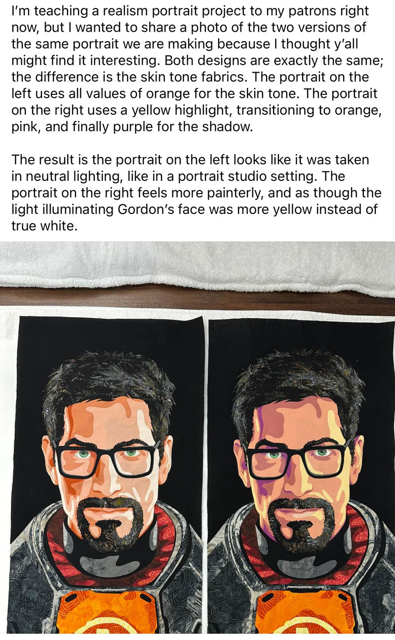
I've been working on a portrait quilt design, using Gordon Freeman as the subject, for my Patrons. I intentionally created two versions of the same face to show how choosing different colored fabrics for the skin tones, while maintaining as similar value as possible, can change the impression of the portrait. Earlier this month I finished ironing the cut pieces of fabric together, and the two faces looked so interesting side-by-side that I decided to share a photo of them on social media.
While many people were similarly fascinated, a few comments gave me the impression that there was some confusion about what viewers were seeing. I'm writing this blog post to clear up any misconceptions about what's going on with my two Gordon Freeman portraits.
Let's begin by looking back at how my portraits were created, followed by a discussion of these misconceptions:
- Misconception 1: The different impressions given by the faces are caused by value, not color.
- Misconception 2: Value is significantly more important than color.
- Misconception 3: One portrait has much higher contrast (ie. difference in value) between the skin tone fabrics than the other portrait.
How Gordon's Portraits Were Created
Gordon started as a digital design. Here are both portrait designs next to the original image I was referencing.
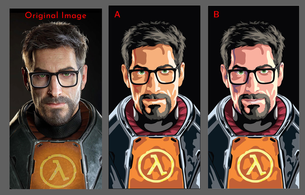
The only difference between these two portraits is the skin tone. Portrait A has a uniform skin tone made from four values of orange. Portrait B has a dynamic skin tone that transitions from yellow to pink to purple. Here are the colors and values of both skin tone progressions:
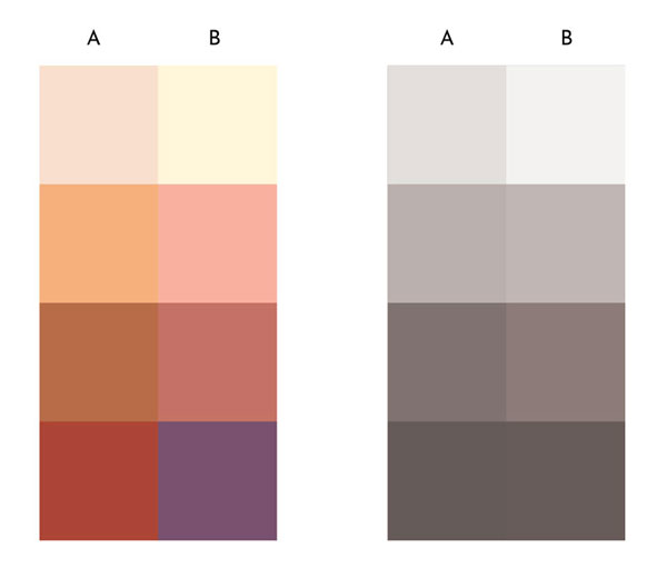
My goal was to choose two progressions of skin tone, using different colors, and have the results look natural with no large jumps in value between any of the steps. I also was intentionally trying to keep the values between the progressions as close as possible to each other.
The values are very close, but there are subtle differences. That is to be expected to an extent when working with different colors, as not all colors have the same value (yellow has a much lighter value than red, for example).
Overall, I was happy with these chosen progressions and continued on to choosing fabric. To do this, I printed the colors on paper swatches, and then matched the color and value of the each swatch to the fabric swatches in my Bella Solids swatch book (I'm holding the swatches for progression B in the image below).
This allowed me to look at every fabric available. While there weren't any perfect options, I ended up picking fabrics that matched best. Those subtle differences can be seen here, where I have all of the paper swatches placed next to the chosen fabric swatches. This screenshot is showing fabrics and swatches for progression A:
The final progression of both skin tone fabrics looked like this:
From here, the fabrics were backed with fusible, cut, and ironed into place. Here are the fully assembled portraits:
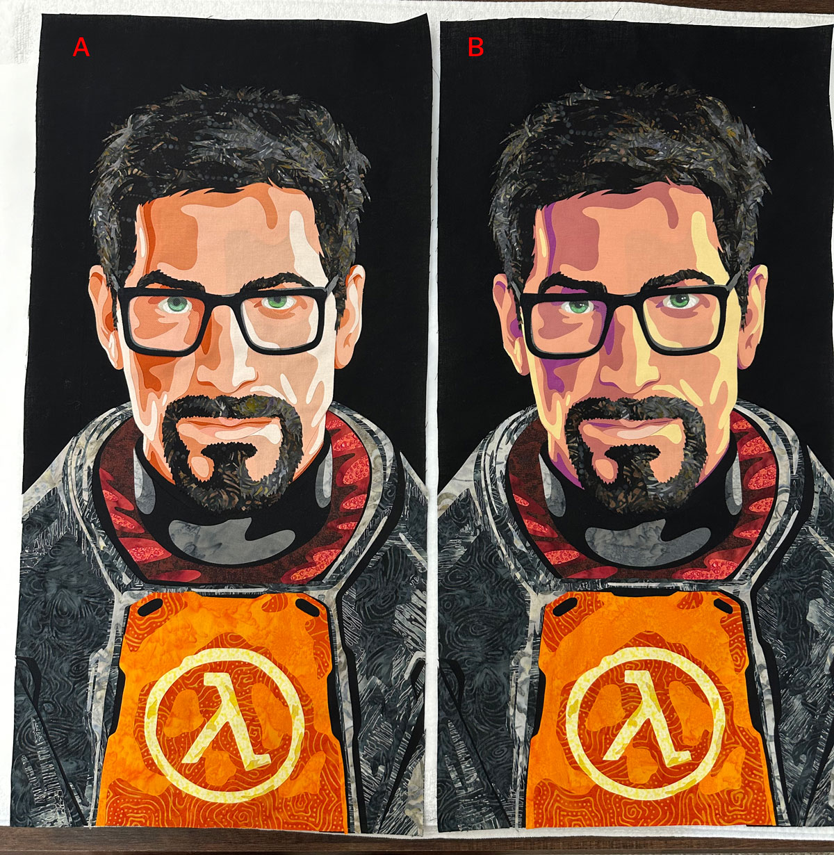
Everything about these portraits is identical except for the four fabrics used for skin tone, and I found the effect remarkable. The portrait on the left — portrait A — looks like it's being illuminated by neutral, or white, light. This kind of light is sometimes referred to as "outdoor" light, although I felt this particular design is more akin to a portrait studio, as there are two clear sources of light and neither are from overhead. (Neutral light outdoors occurs when the sun is high in the sky.)
Portrait B, on the other hand, looks like he is being illuminated by warm light. His face has a distinct warmth to it, and that yellow highlight would only be caused by a very warm (aka. yellow or gold) light source. Someone commented that he looked like he was sitting next to a bedside lamp.
But the fact is that despite using two completely different sets of fabric, both of these faces look "real" and "natural", albeit in different circumstances.
Misconception 1
The different impressions given by the faces are caused by value, not color.
(Meaning the impression that one face looks to be outdoors while the other face looks to be next to a warm, bedside lamp.)
Let's look at another example portrait to see how value is only part of the story when it comes to reading the impression an image gives.
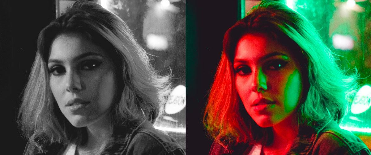
When looking at the desaturated version of the photo, this girl looks like she's inside — or perhaps outside but next to a glass storefront. We can tell that she's being lit by two light sources, but it's hard to glean any more context about her. In the full-color version, we see that the lights are actually red and green, making her look like she's in a nightclub. That context is caused entirely by the color, not the value.
This same principle is what gives the two Gordon portraits their distinctive impressions. It's the color, not the value, of the fabrics that makes the portraits feel like they're in different settings.
Misconception 2
Value is significantly more important than color, to the point that a face could be created using any color(s) and as long as the values are correct, it will still "read" as a face.
This is a dangerous line of thinking because it encourages the dismissal of color. Are there situations where value is more important than color? Yes. But when it comes to realism design, color is just as critical.
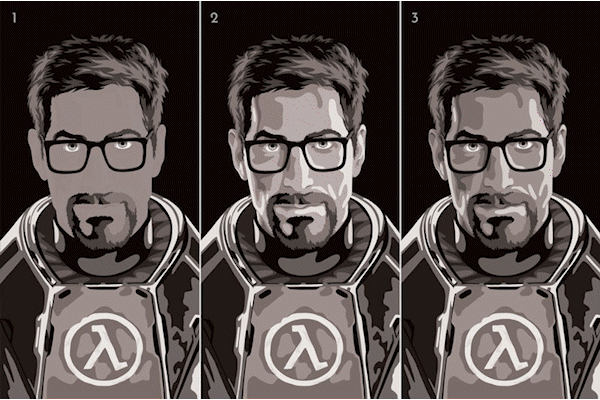
Take a look at these very colorful Gordon Freemans. The animation transitions from color to grayscale and back:
Here are the Gordons in color in a still image:
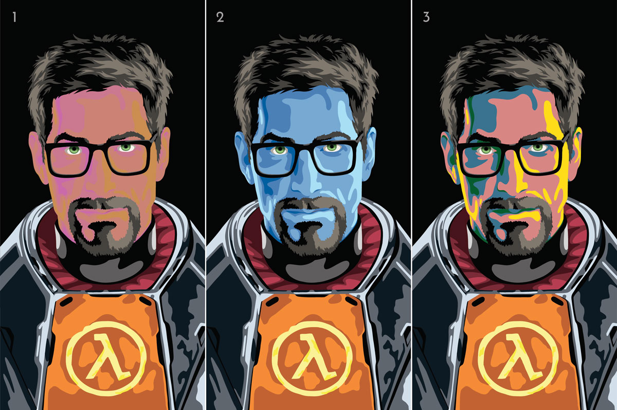
Face 1 (left): The four different colors used for this face have exactly the same value. When in greyscale, there is no perceptible difference, meaning Gordon's nose and lips are entirely lost.
Is this a "good" portrait? No, of course not. But the takeaway is that value, while critically important, does not work alone. Only the color is providing any semblance of definition to Gordon's face. We still "read" him as a face even with zero change in value.
Face 2 (middle): This Gordon has a very natural-looking transition of values. In greyscale, he looks completely natural. But in full-color, he actually has blue skin. This proves that color is necessary to provide context in realism design. Would this Gordon (or any other portrait made with these blue fabrics) work in another setting? Honestly, yes. But the purpose of this project was to create a realistic face, and that means paying equally as much attention to color as value.
Face 3 (right): Once again, this Gordon has a very natural transition between values. But the colors of Gordon's skin are jarring and in no way realistic. These colors are so harsh they're affecting the readability of his face because my eyes are focusing too hard on the individual sections of color instead of the overall appearance of his portrait. I’m no longer “reading” the Highlight as a “highlight”, for example. It just looks like giant blobs of yellow.
These three examples show that while value is unquestionably important, it is not the supreme factor in determining how a viewer can "read" a face. Color is equally as significant.
Misconception 3
One portrait has much higher contrast between the skin tone fabrics than the other portrait. Specifically, skin tone progression B had more contrast than progression A.
This observation was made in reference to the midtone and shadow fabrics used for Gordon's forehead, but let's look at all of the skin tone fabrics.
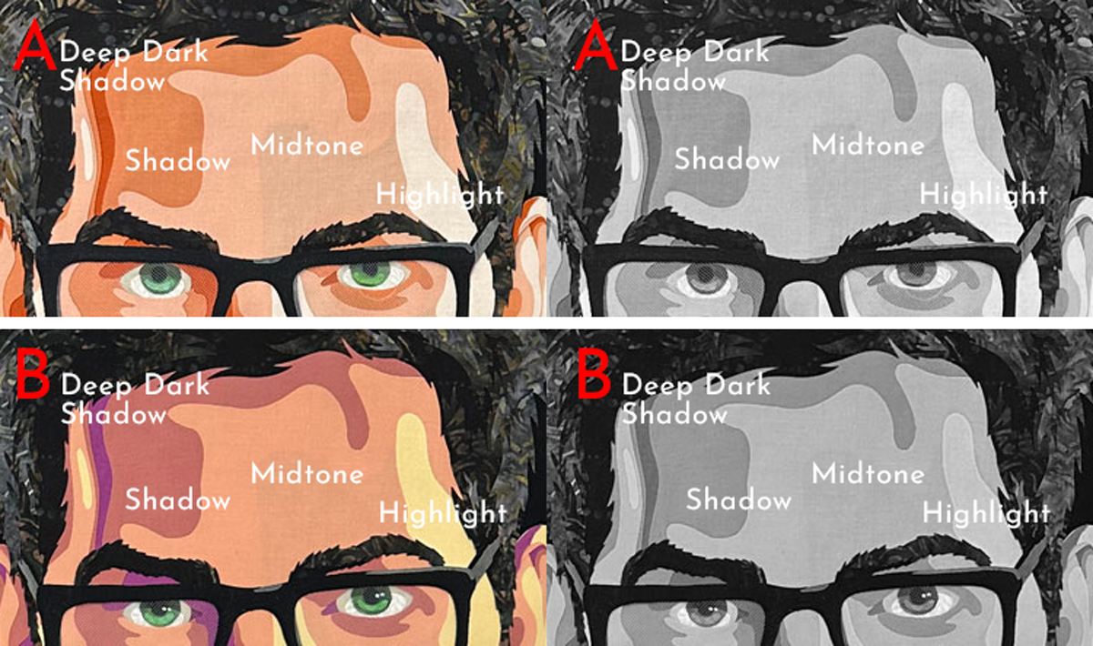
In the interest of staying objective, I color-picked all four fabrics used in each skin tone progression (8 fabrics total), converted them to grayscale (removing color allows us to compare values alone), and used the HSB color model in photoshop to find the brightness of each. In the HSB model, 100% is pure white and 0% is pure black. Here is how the 8 fabrics compare to each other:
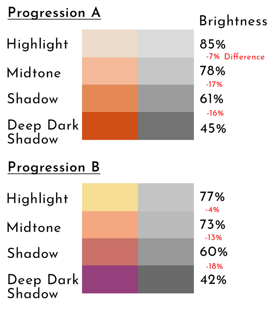
There is a greater difference in overall value in progression A (40%) compared to progression B (35%). That is only a 5% difference in overall change between the portraits. That is really close considering I was using 8 entirely different fabrics.
When comparing the individual steps themselves, progression A's Highlight is 8% brighter than progression B's (85% vs 77%). The other three steps in progression A are 5% (Midtone), 1% (Shadow), and 3% (Deep Dark Shadow) brighter than progression B, respectively. (Referring back to Misconception 1, there is not much difference in values between these two portraits. The far great difference is color.)
Back to Misconception 3, which posits there is a much higher degree of contrast between progression steps (ie. Midtone-to-Shadow) in progression B than progression A. Is this true? Well, let's compare.
The difference in progression steps between portrait A and B:
- Highlight to Midtone: A (7%) vs B (4%) = 3% difference
- Midtone to Shadow: A (17%) vs B ( 13%) = 4% difference
- Shadow to Deep Dark Shadow: A (16%) vs B (18%) = 2% difference
Progression A actually had the greatest contrast in the first two comparisons (Highlight-to-Midtone and Midtone-to-Shadow), but overall there is only a 4% or less difference between any given step in these two portraits. This amount of difference is negligible.
Conclusion
Posting online can easily turn into an adventure, but I'm happy to have the chance to take a deeper look at color and value in relation to fabric portraiture. In hindsight, I think there was a bit of "checker shadow optical illusion" going on with the full picture I posted online. If you've never seen this illusion, it's a way to demonstrate that what our eyes perceive isn't always what is truly there.
Here is the illusion (below). The A and B squares are the same grey. They look different because of the other grey squares surrounding them and changing their visual impression.
The takeaway is a reminder that I can't trust my eyes. It's too easy to be deceived. This exercise proved to me that it's critically important for me to continue tweaking my color choices digitally and then continue to rely on my printed color swatches to choose fabrics. Falling back on this objective process is how I can ensure I'm selecting the right colors and values of material.
